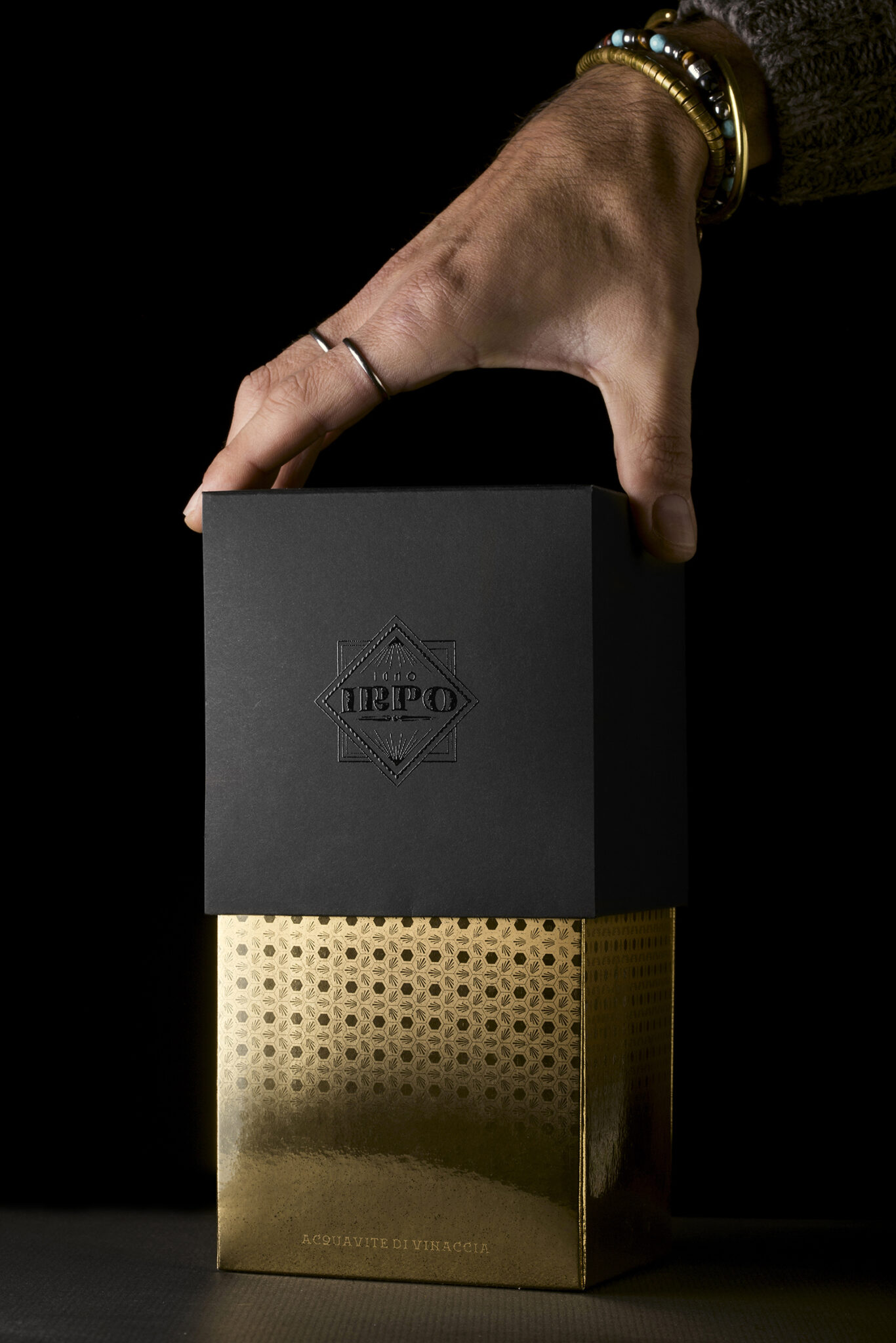
IRPO Acquavite di Vinaccia
In the Oscan language, a language used by the archaic populations of central Italy, IRPO means wolf and, according to legend, the Irpines chose this incredible animal as a totemic symbol of strength, empathy and collaboration.
Each wolf within its own pack plays an important role and works for the good of all. The movement of wolves towards the goal is an ensemble dance, in which no one is left behind and each member contributes to the achievement of a common goal.
Even today, the wolf represents the green Irpinia, the place where the extraordinary distillate created by the inspiration of the Antonellis Distillery comes to life to preserve the flavors and aromas of a sweet and relentless nature.
As with wolves, the shared intentions of a group’s success in achieving a goal, and it is precisely from the collaboration that this project, conceived and coordinated by Andrea Basile, BasileADV, is born. The fonts and design created by Giuseppe Salerno and Paco González, Resistance, instill charm to the labels produced on the highest quality papers.
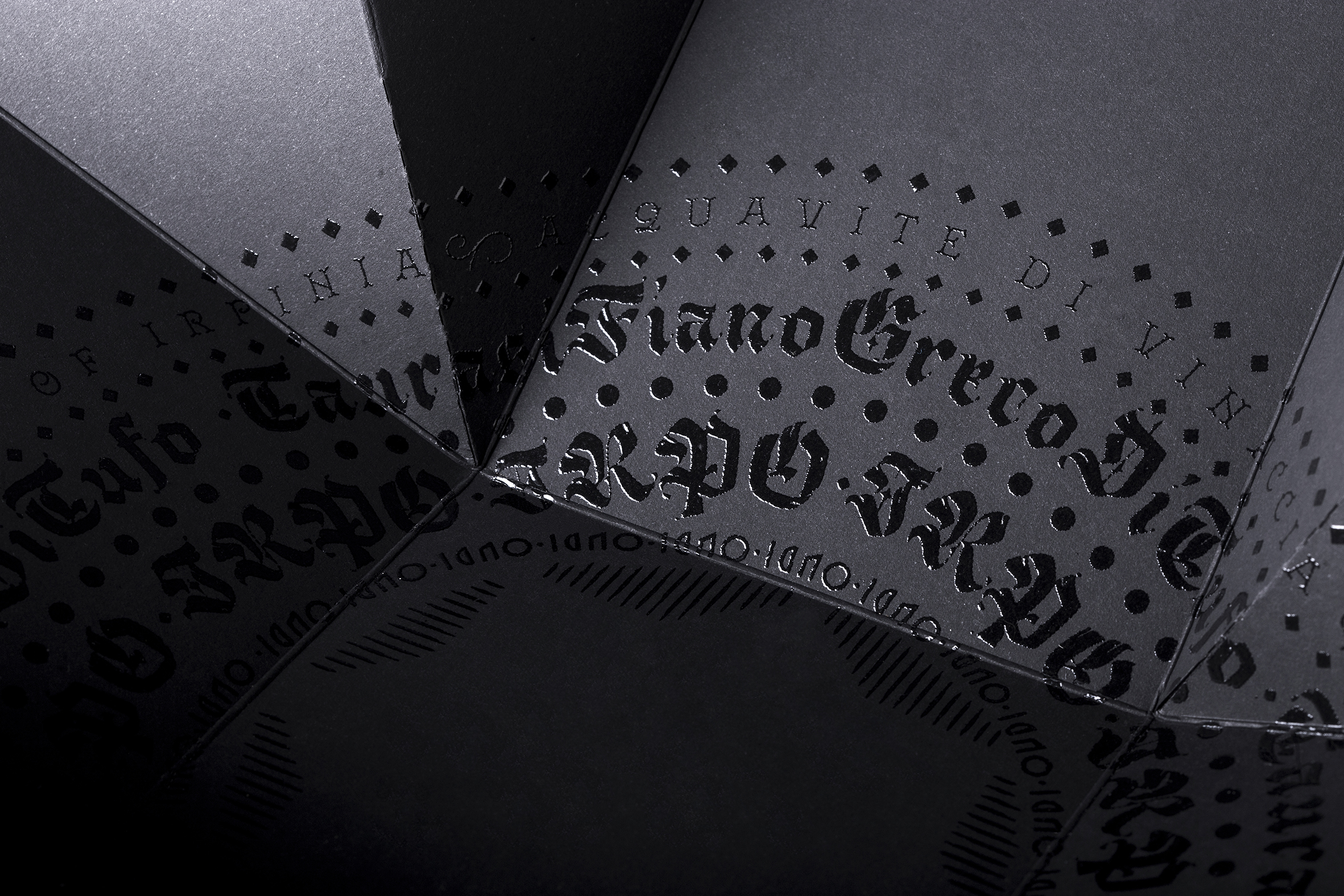
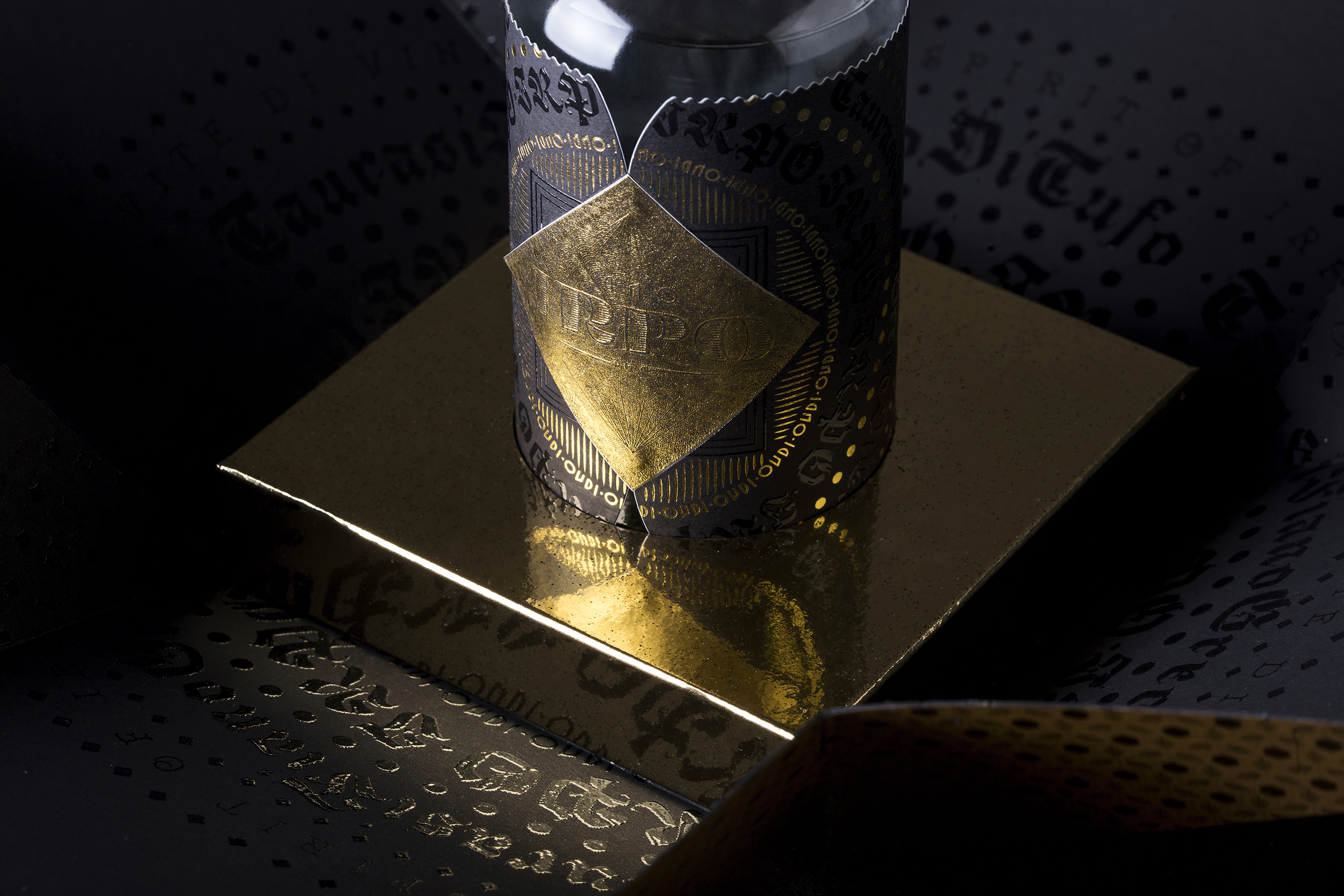
The golden foils distributed by Luxoro and printed by the La Commerciale typography make characters, strokes and letters with an ancient and fascinating flavor shine on the dark background.
The 200 ml bottles produced by Vetroelite wear the product brand with elegance and audacity, thanks to the precious adhesive papers of Arconvert.
Hidden on the back of the label, an evocative illustration by Andrea Longhi recalls the power of the animal that inspired this undertaking.
Just like in a distillate, each person involved has added their own drop of knowledge to make this extraordinary project unique, told by the photographs taken by Diego De Dominicis, d / dedo Studio, by the packaging produced by Grafica Nappa, by the printed illustrative brochure. from the Lucarelli graphics on paper supplied by the Fedrigoni Special Papers mill and from the texts by Alessio Morando.
The end result is a combination of creativity and territorial identity, it is the imagination that meets craftsmanship and moves in the constant search for excellence in the subtle space that separates tradition and magic.
Irpo is a grappa born of inspiration and the desire to interpret and offer the flavors of the Irpinia area in grappa.
It encompasses the distillation blend of Aglianico da Taurasi, Fiano di Avellino and Greco di Tufo, wisely selected and „put to rest“ wines so that the aromas and aromas of the three vines can blend into the raw material and then into „non matter ”, distillation.
With a single passage in a bain-marie, the narrowest heart in alcohol content of these three vines is distilled so that they can express the maximum of their strength and refinement in a single hedonic blend.
A distillate with a thousand flavors and aromas that, with closed eyes, bring the mind and senses back to what they have never interpreted in nature.


