• It
Sign in Pulp 28
Pulp
Sign in Pulp 28
Pulp
  • Inspiration93
  • Stories88
  • News174
  • Pulp Archive
  • Materials Index
  • About Pulp
  • Sign in
  • Pulp 28
  • It
Browse Themes
Corporate communicationDigital printingGraphic designIllustrationInterviewsLabelLarge formatPackagingPeople & PaperPhotographyPrintingPublishingSustainabilityInspirationStoriesNews
Pulp

Log-In

Please enter your credentials to access all Pulp contents.

Forgot your password?

New to Pulp? Register for free

New to Pulp?

Register for free to have full access to our content.

Register

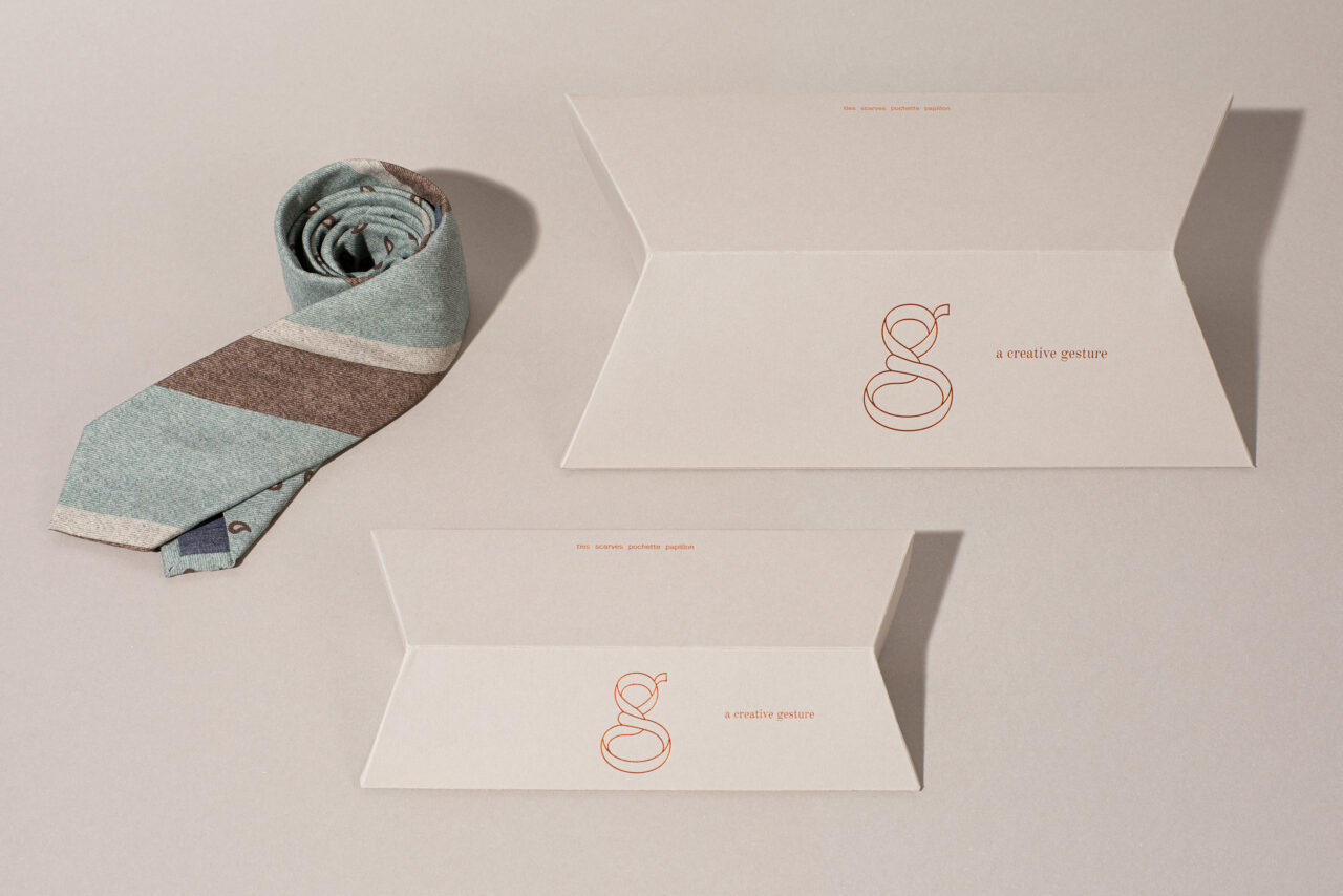
Foldable packaging for GierreMilano produced in two sizes, using Materica Clay 350 g/m2 and printed in hot foil.

3 min minutes
News

The art of the tie

Milanese agency Ascionemagro has created an expressive logo and packaging for accessories brand GierreMilano
Graphic designPackagingPeople & PaperPrinting

Foldable packaging for GierreMilano produced in two sizes, using Materica Clay 350 g/m2 and printed in hot foil.

Ascionemagro, a graphic design studio based in Milan, has helped Italian men’s accessories company GierreMilano restructure their tie packaging and update their visual brand. As the focal point of the branding, their design for the GierreMilano logo is a playfully illustrated lowercase letter ‘g’ that captures the action of tying a tie. This whimsical approach reflects the tradition of the company (founded in 1979) and also the humorous spirit they embody – echoing their motto of ‘a free spirit that celebrates the gesture as an expression of a state of mind’.

The studio began when graphic designers Valentina Ascione and Onofrio Magro (originally from Palermo and Naples) left Milan’s FM Studio and started working together, first as freelancers and then as business partners in Ascionemagro. Both principals have a distinct appreciation for materials and the process of production. They specialise in developing ‘strong concepts and complex identity systems for both analogue and digital media’.
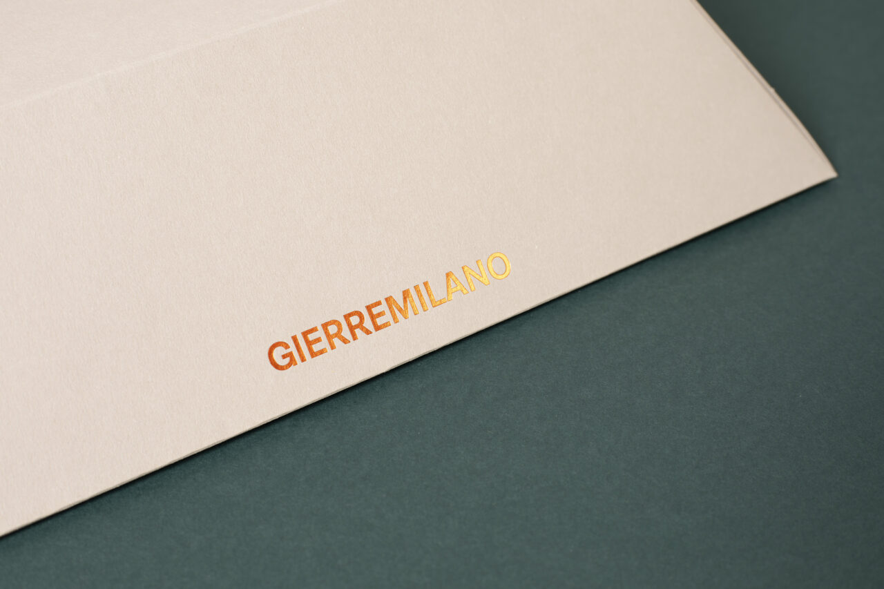
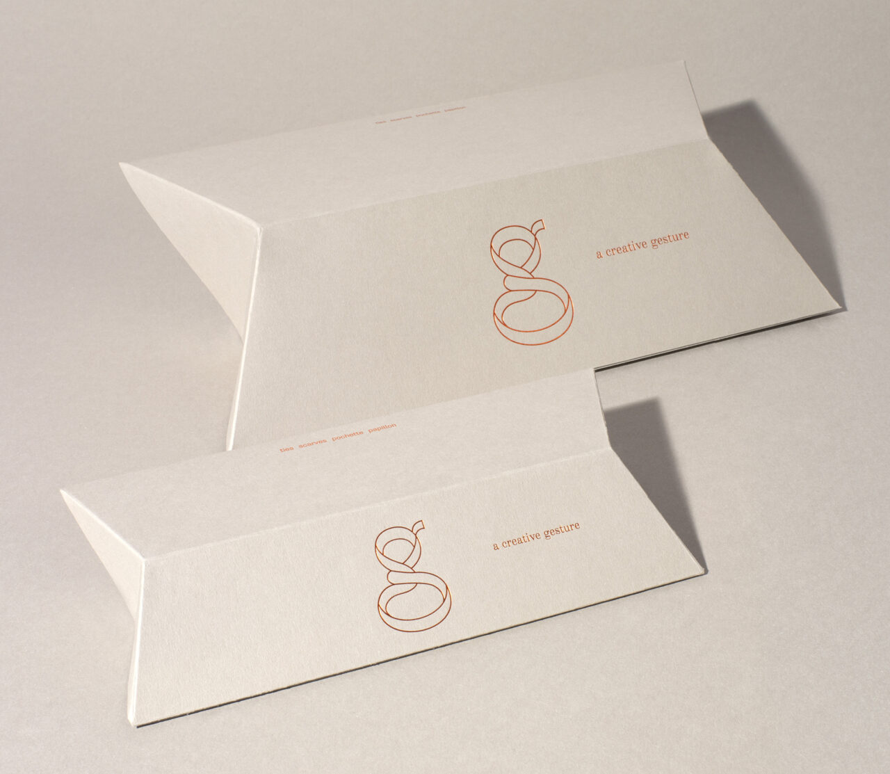
GierreMilano has been a client since 2013. The new tie packaging design focuses on streamlining an earlier version of the packaging and creating something functional – a self-assembling box that is compact and easy to handle. Ascione and Magro explain: ‘We redesigned the pack thinking about linear, geometric shapes and a simpler opening system’.

To create this appealing package, Ascionemagro sought a soft, tactile and natural paper. ‘After several samplings, Materica proved to be the perfect paper for this project,’ they state.

Paper: Materica Clay 350g/m2

gierremilano.it

ascionemagro.com

Featured Materials

Materica

Pulp-coloured papers and boards made with 40% CTMP fibres, 25% pure environmentally friendly fibres, 20% recycled material and 15% cotton fibres. Also available in self-adhesive version.

Related articles

Stories 17/06/2022

People and paper: Mirko Borsche

Mirko Borsche’s designs for the Bavarian State Opera are as adventurous as the institution’s world-class productions. By John L. Walters
Graphic designInterviews
Stories 05/01/2023

Slow perfume

Perfume is a living experience
Graphic designPackagingPrinting
News 06/10/2022

Behind the building

A new book examines the unseen processes used in the creation of contemporary Australian architecture
Corporate communicationGraphic designPhotographyPublishing
News 01/08/2024

Threads of community

This ambitious project mixes up a diverse collection of creative and educational work from Aotearoa New Zealand and beyond
Graphic designPrintingPublishing
Pulp © 2026
Fedrigoni
Fedrigoni
COOKIE POLICY PRIVACY POLICY ACCESSIBILITY STATEMENT
Pulp © 2026