
• It
Sign in Pulp 28
Pulp
Sign in Pulp 28
Pulp
  • Inspiration93
  • Stories88
  • News174
  • Pulp Archive
  • Materials Index
  • About Pulp
  • Sign in
  • Pulp 28
  • It
Browse Themes
Corporate communicationDigital printingGraphic designIllustrationInterviewsLabelLarge formatPackagingPeople & PaperPhotographyPrintingPublishingSustainabilityInspirationStoriesNews
Pulp

Log-In

Please enter your credentials to access all Pulp contents.

Forgot your password?

New to Pulp? Register for free

New to Pulp?

Register for free to have full access to our content.

Register

3 min minutes
News

Typographic calendar

Studio A. Stein and printing company Imprimerie Chauvat-Bertau collaborate on a dazzling promotional calendar
Corporate communicationGraphic designPrinting
‘We imagined a calendar offering a real tactile experience and demonstrating the full range of ICB’s capabilities.’
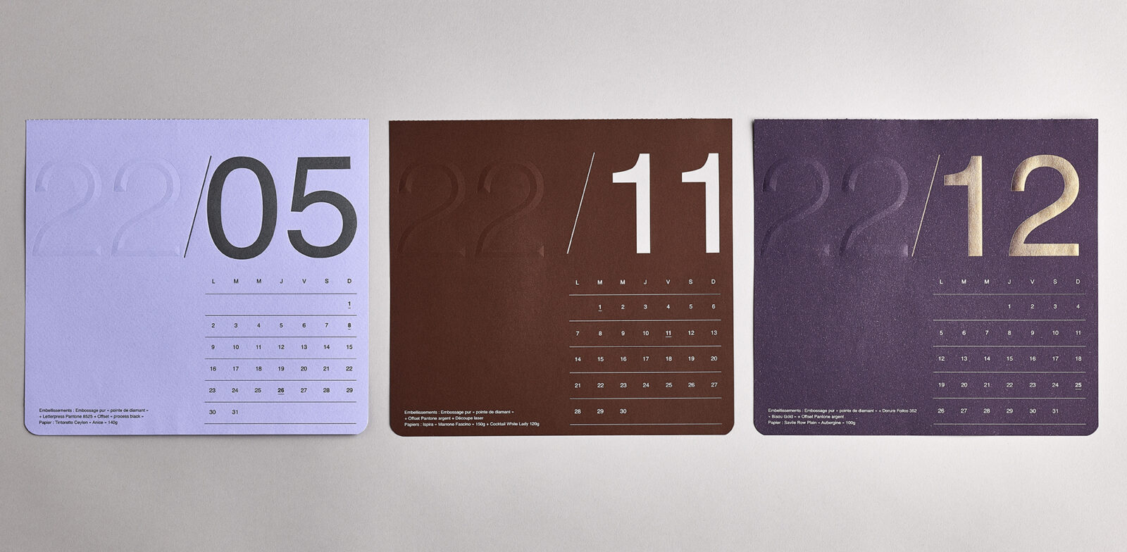
Dijon-based Studio A. Stein is an independent design practice established in 2007 with French designer Aurélien Stein at the helm. Stein’s practice is truly centred around collaboration – working with trusted partners such as printers, photographers and copywriters to produce work for sympathetic clients.

It was in this collaborative spirit that he was approached by Parisian printers Imprimerie Chauvat-Bertau (ICB). Led by Pierre Bertau, the company produces an annual promotional calendar, working with a different designer each year.

For ICB’s 2022 calendar Bertau asked Stein to collaborate on the project, with total creative freedom given to the designer to choose the composition, paper stocks and printing techniques. Stein says, ‘The only guideline was to create a calendar that would show the extent of the printing company’s expertise.’

Stein’s approach to the artwork was heavily focused on typography, a nod to the Modernist inspiration of influential Swiss graphic designer Josef Müller-Brockmann, with a square format and rounded corners. Stein chose a different paper for each month, selecting some of his favourite textured Fedrigoni papers, including Materica, Savile Row and Woodstock.

One consistent feature was that each calendar sheet had a blind emboss of the year number ‘22’. The number of each month was printed with different printing techniques to make them dazzle – metallic Pantones, thermography and foil stamping, to name a few, all with a Singer-sewn binding.

As Stein says, ‘We imagined a calendar offering a real tactile experience and demonstrating the full range of ICB’s capabilities.’

Papers:
Materica
Savile Row
Woodstock

studioastein.com

icb-imprimerie.com

Featured Materials

Woodstock

Recycled uncoated papers and boards with 80% pre-consumer recycled waste and 20% FSC certified virgin fibre, pulp coloured. Also available in self-adhesive version.

Materica

Pulp-coloured papers and boards made with 40% CTMP fibres, 25% pure environmentally friendly fibres, 20% recycled material and 15% cotton fibres. Also available in self-adhesive version.

Related articles

News 27/04/2023

Gourmet elixir

Based on old apothecaries, Gallén+Ibáñez promote truth and quality with Carmen del Poaig extra virgin olive oil packaging
Graphic designPackagingPrinting
Stories 30/11/2023

People and paper: Marco Nespolo

‘The bar is increasingly set much higher in terms of what we need to do to defend our planet.’ Fedrigoni Group CEO Marco Nespolo talks to Pulp. Photographs by Luigi Fiano
People & PaperPrintingSustainability
News 07/03/2024

Fortune and photography

Justin Aversano’s Smoke and Mirrors has a contemporary take on the tarot
Graphic designPhotographyPrintingPublishing
Inspiration 31/07/2025

Luxury in a tin

The colourful packaging of Sturios, a new line of caviar, was designed by Spanish studio Lacía
Digital printingGraphic designLabel
Pulp © 2026
Fedrigoni
Fedrigoni
COOKIE POLICY PRIVACY POLICY ACCESSIBILITY STATEMENT
Pulp © 2026