

The health benefits of bathing in hot springs have long been known. Since the eighteenth century, scientific journals have reported on the waters of Levico Terme in Trentino, northern Italy, and helped make it one of the world’s most famous spa towns, its first spa building opening in 1860. The town claims its thermal waters, rich in arsenic and iron, were praised even further back in 1673 in Michelangelo Mariani’s History of the Council of Trent.
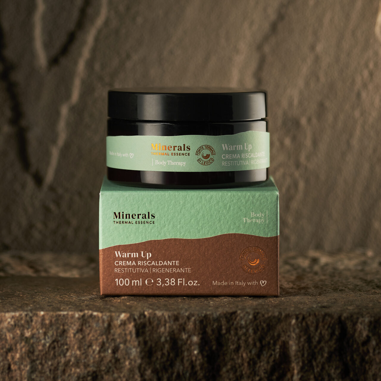
Milan practice The Studio was commissioned by Terme di Levico, the company that maintains and promotes the town’s thermal springs, to design a new identity for the organisation, which included design and packaging for a skincare range they named Minerals – Thermal Essence.
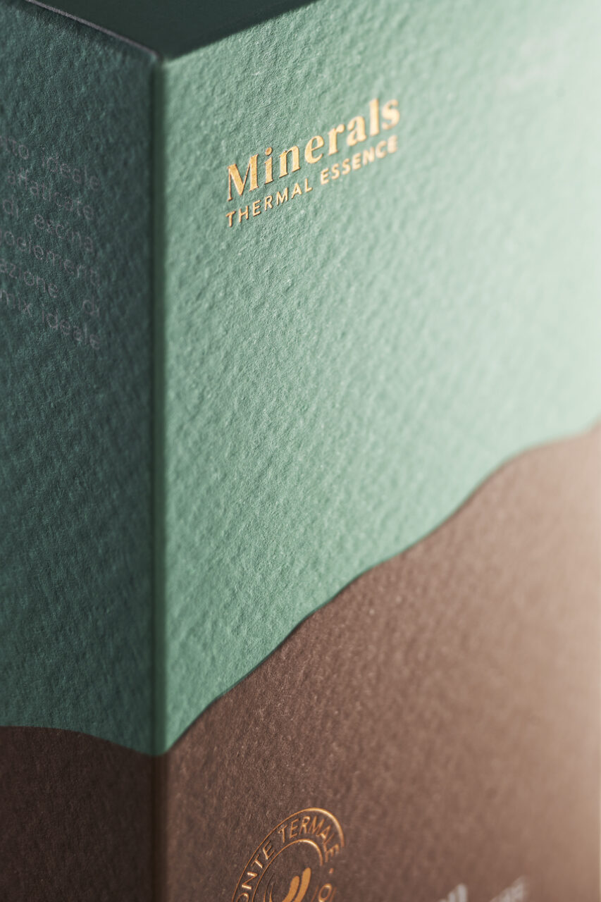
The designers referenced the skyline of the Panarotta and Monte Fravort landscape, the area from from which the Levico thermal spring flows. This was stylised as a graphic device that suggests the mountains and water.
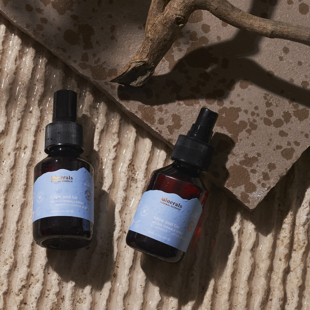
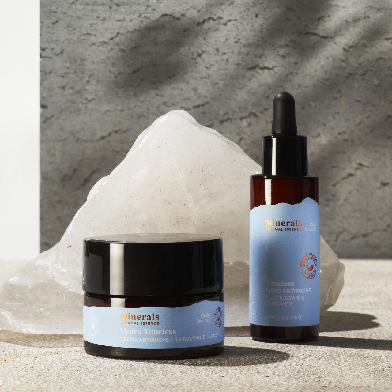
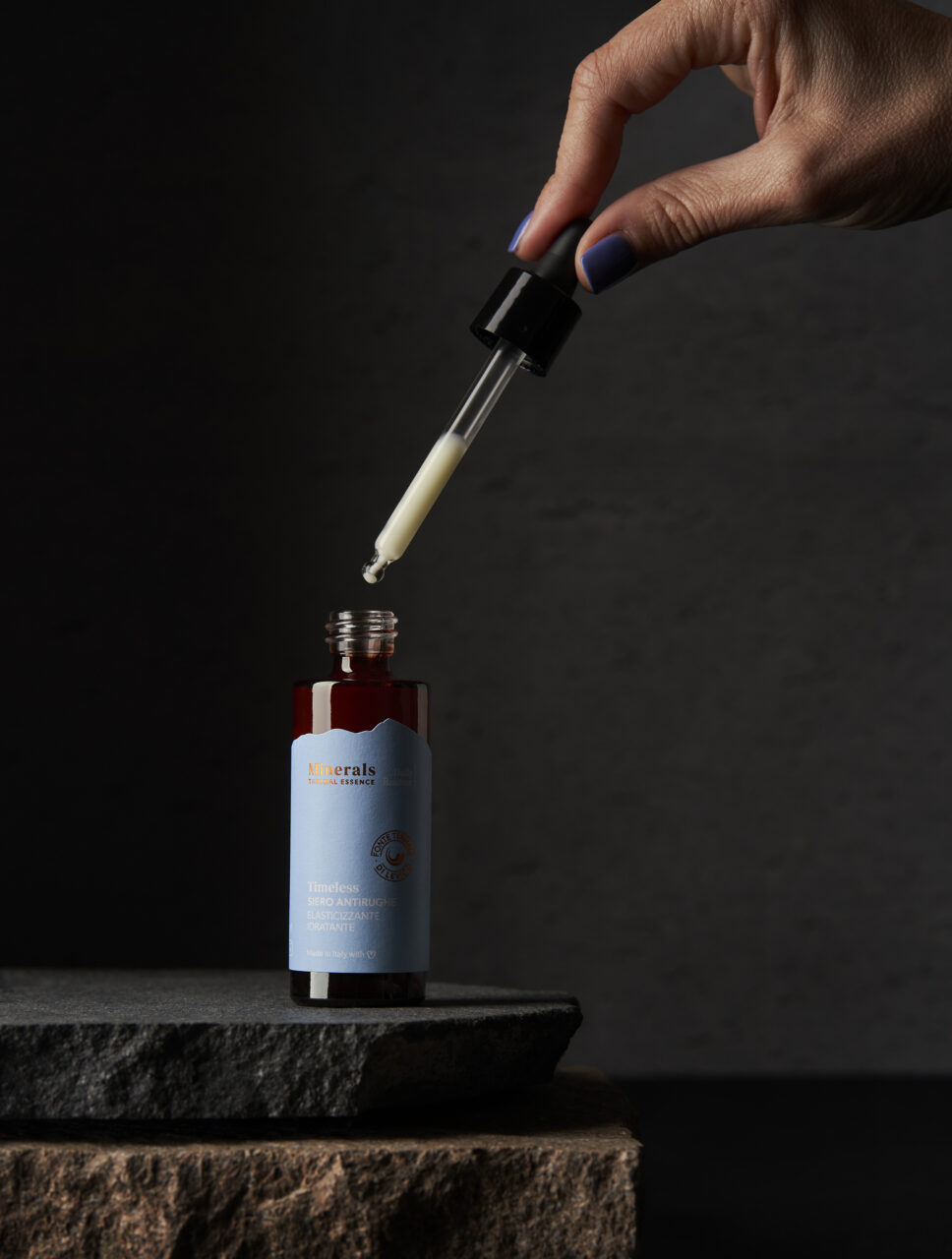
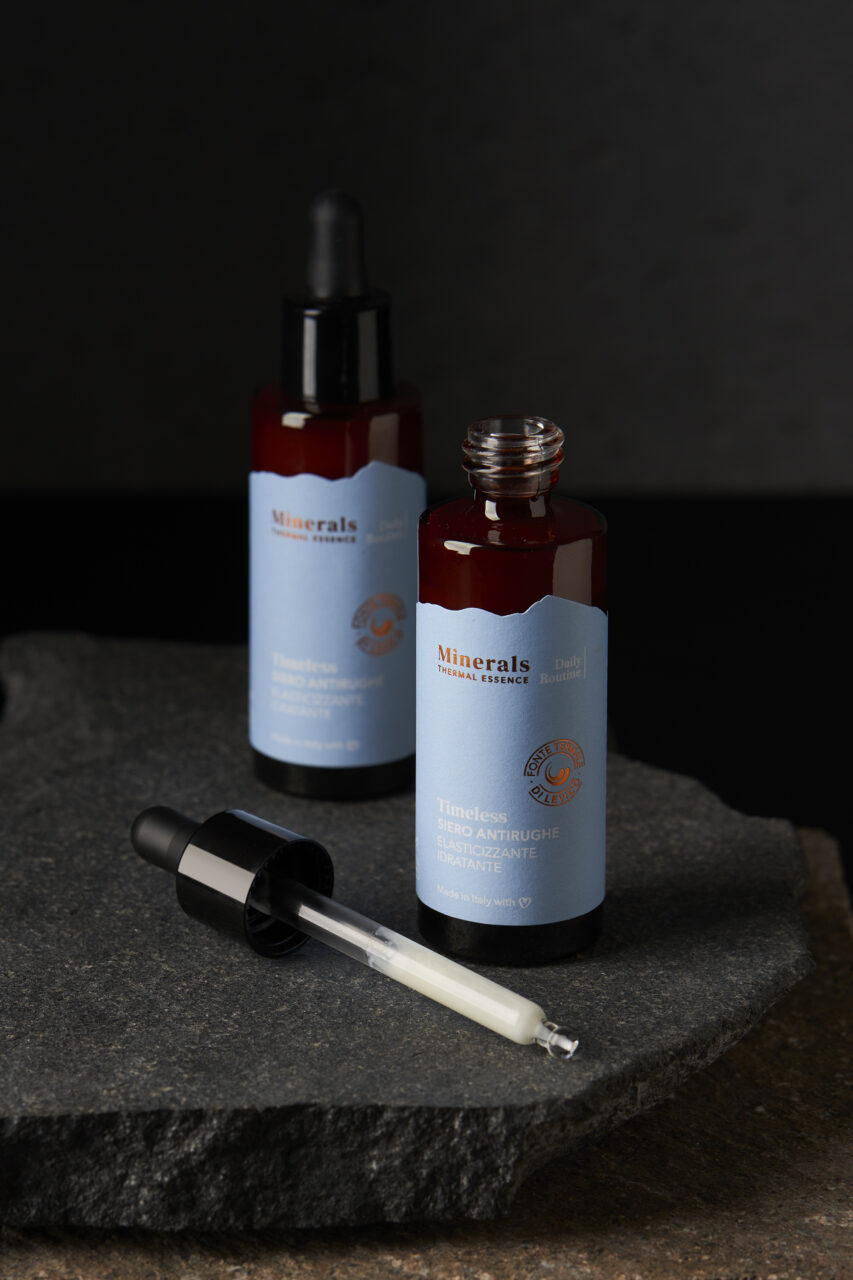
The products boast a minimal and clean design, with a calm colour palette that features copper foiling. The Studio’s creative director, Laura Menichelli explains that this refers ‘to the characteristic colour of Levico’s arsenic-ferruginous water.’
Colour choices were also key to the RPET plastic bottles and amber-coloured glass jars that recall pharmaceutical containers of the nineteenth-century, the period that saw Levico’s first thermal establishments. The reddish tones also refer to the characteristic colour of the waters.
The Minerals – Thermal Essence packaging uses Tintoretto Ceylon Crystal Salt 350 g/m2, which, according to Menichelli, ‘has the grain of stone and the softness of water, giving materiality to the touch.’ The labels use Waterproof White, ‘an FSC-certified natural paper which has optimal water resistance given the need to use some of the products in the shower.’
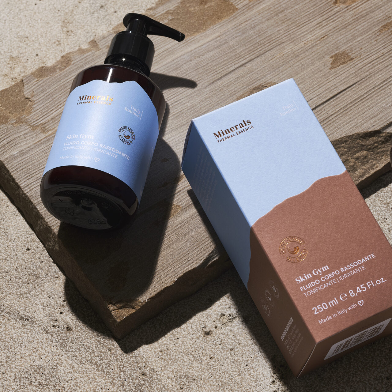
Photography by Deep Blue Studio
Papers:
Tintoretto Ceylon Crystal Salt 350g/m2 (packaging)
Waterproof White (labels)