

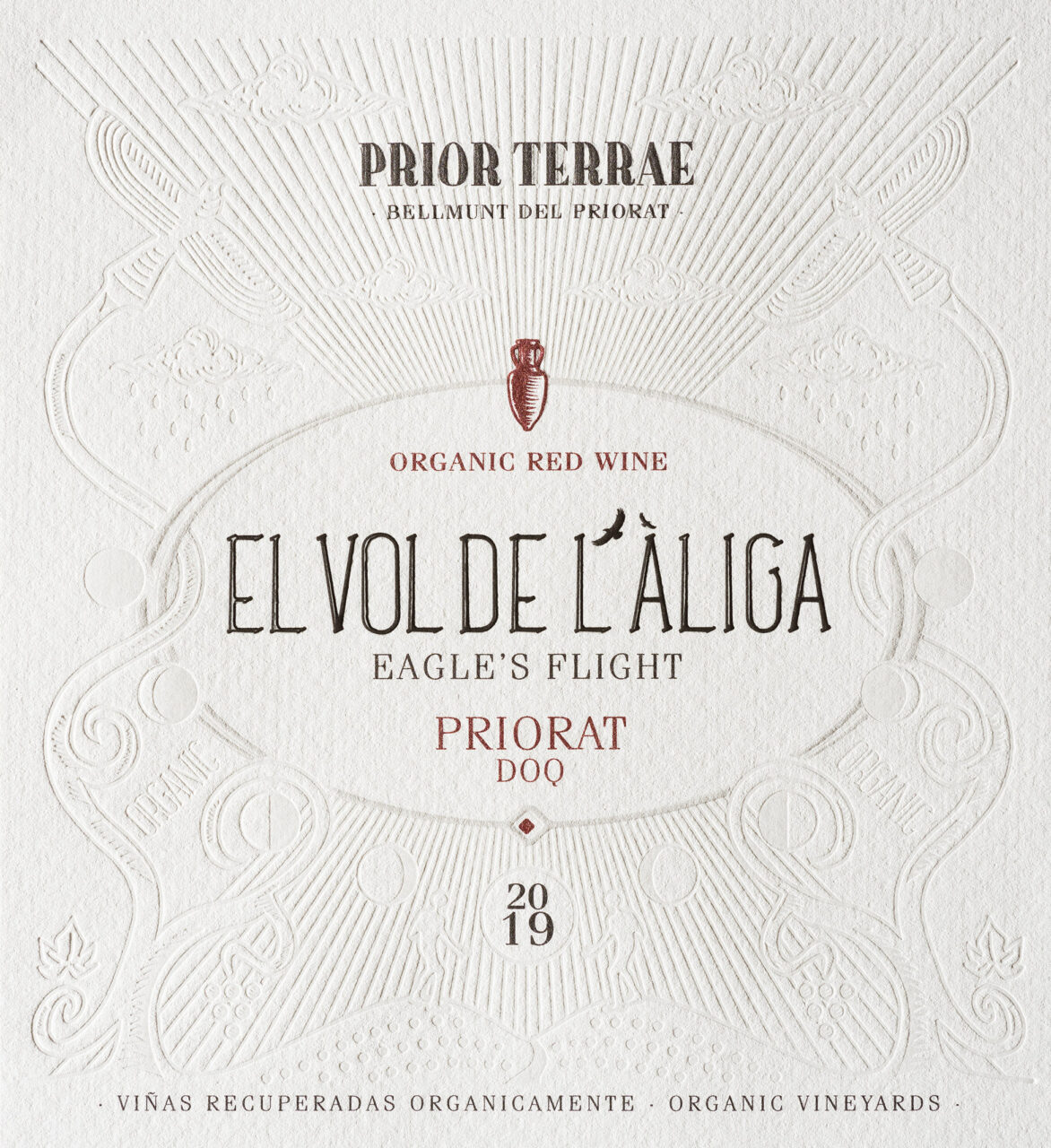
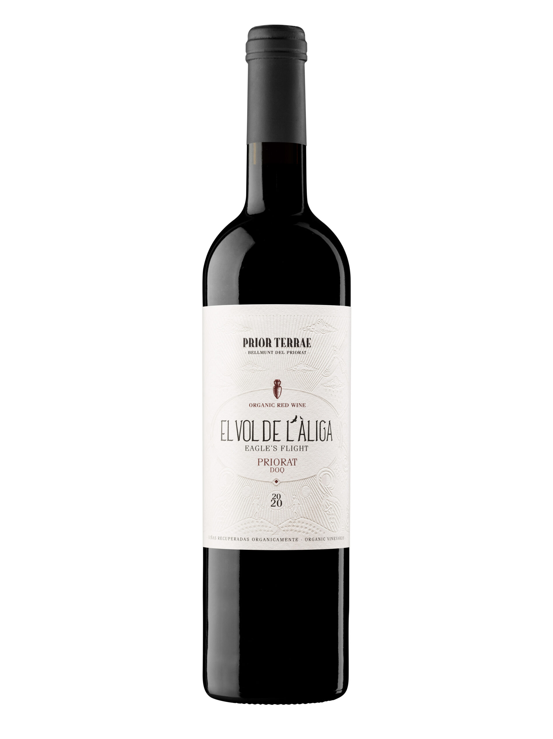
Barcelona-based Gerard Riu Design partnered with winery Prior Terrae to complete their ‘Viticultors del Priorat’ project with a selection called ‘El Vol de l’Àliga’ (translated to ‘Eagle’s flight’), led by winemaker Judit Llop. The vineyards, located in Bellmunt del Priorat in Catalonia, Spain, are ecologically certified with a focus on the organic and sustainable aspects of the wines’ growing and production processes.
The history of the Prior Terrae vineyards and this specific project is one of ‘rehabilitation’. The winery organically recovered their damaged vineyards in Bellmunt del Priorat, with a process involving probiotic treatments led by Llop, along with a four-year study conducted together with the nearby Rovira i Virgili University.
The team took this recovery and consequential self-sufficiency of the vineyards into account when considering a name and design for the label. The rehabilitation of the area invited the return of wildlife, which included a pair of Bonelli’s eagles, hence the name. When referencing this recovery and the returning eagles, a farmer says: ‘Now, when we are working the vineyard, we see them fly again’.
Designer Gerard Rui recounts that when he and the winery initially discussed the project they discussed ‘a design that would transmit the ecological and ancestral aspects with an esoteric tone’. He adds: ‘We needed a label that explained the reason for the name and the meaning of the story behind it, while maintaining the artisanal, local, and organic character’.
Asked about the creative process for the label Rui says: ‘We decided to make an illustration that would not be printed, but would be based on engravings and reliefs, without ink. An allegory for the reason of the name “the flight of the eagle”. We took maximum care of the finishes to give it the rustic and ancestral tones, which provide a unique character.’
Paper: Cotone Bianco Ultra WS
Printer: Vidal & Armadans
Photography: Blai Tarda