
• It
Sign in Pulp 28
Pulp
Sign in Pulp 28
Pulp
  • Inspiration93
  • Stories88
  • News175
  • Pulp Archive
  • Materials Index
  • About Pulp
  • Sign in
  • Pulp 28
  • It
Browse Themes
Corporate communicationDigital printingGraphic designIllustrationInterviewsLabelLarge formatPackagingPeople & PaperPhotographyPrintingPublishingSustainabilityInspirationStoriesNews
Pulp

Log-In

Please enter your credentials to access all Pulp contents.

Forgot your password?

New to Pulp? Register for free

New to Pulp?

Register for free to have full access to our content.

Register

3 min minutes
News

Fly like an eagle

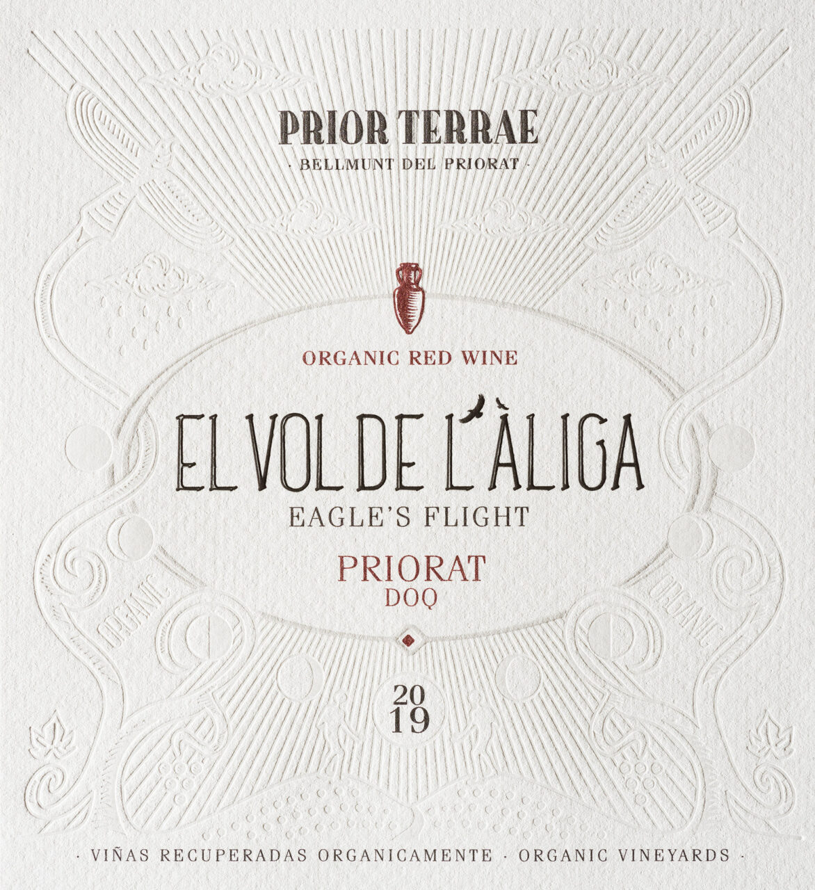
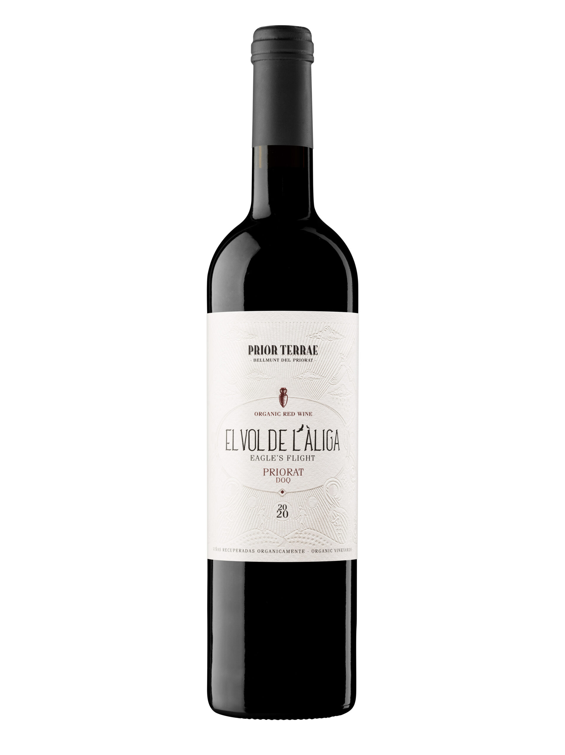
Gerard Riu Design creates embossed labels for El Vol de l'Àliga, partnering with the Spanish winery Prior Terrae
Graphic designLabelPrintingSustainability

Barcelona-based Gerard Riu Design partnered with winery Prior Terrae to complete their ‘Viticultors del Priorat’ project with a selection called ‘El Vol de l’Àliga’ (translated to ‘Eagle’s flight’), led by winemaker Judit Llop. The vineyards, located in Bellmunt del Priorat in Catalonia, Spain, are ecologically certified with a focus on the organic and sustainable aspects of the wines’ growing and production processes.

The history of the Prior Terrae vineyards and this specific project is one of ‘rehabilitation’. The winery organically recovered their damaged vineyards in Bellmunt del Priorat, with a process involving probiotic treatments led by Llop, along with a four-year study conducted together with the nearby Rovira i Virgili University.

The team took this recovery and consequential self-sufficiency of the vineyards into account when considering a name and design for the label. The rehabilitation of the area invited the return of wildlife, which included a pair of Bonelli’s eagles, hence the name. When referencing this recovery and the returning eagles, a farmer says: ‘Now, when we are working the vineyard, we see them fly again’.

Designer Gerard Rui recounts that when he and the winery initially discussed the project they discussed ‘a design that would transmit the ecological and ancestral aspects with an esoteric tone’. He adds: ‘We needed a label that explained the reason for the name and the meaning of the story behind it, while maintaining the artisanal, local, and organic character’.

Asked about the creative process for the label Rui says: ‘We decided to make an illustration that would not be printed, but would be based on engravings and reliefs, without ink. An allegory for the reason of the name “the flight of the eagle”. We took maximum care of the finishes to give it the rustic and ancestral tones, which provide a unique character.’

Paper: Cotone Bianco Ultra WS

Printer: Vidal & Armadans

Photography: Blai Tarda

gerardriugd.com

vidalarmadans.com 

Gerard Riu Design Instagram

priorterrae.es

Featured Materials

Cotone

The Cotone range includes treefree papers with a precious felt-marked texture a different nuances including black pulp-dyed versions, which make it one of the must-have self-adhesive papers preferred by label designers all over the world.

Related articles

News 14/03/2024

Money in the packet

International packaging design agency Burgopak uses Sirio Color for innovative card sleeve projects
Graphic designPackagingPrinting
News 27/04/2023

Gourmet elixir

Based on old apothecaries, Gallén+Ibáñez promote truth and quality with Carmen del Poaig extra virgin olive oil packaging
Graphic designPackagingPrinting
Stories 17/04/2025

The Tipoteca

James Clough lists some of the treasures held by Italy’s foremost type museum
Graphic designPrinting
News 21/12/2023

Raw inspiration

In Florence, Kidstudio partners with chef Vito Cortese to package a delicious new line of vegan treats
Graphic designPackagingPrinting
Pulp © 2026
Fedrigoni
Fedrigoni
COOKIE POLICY PRIVACY POLICY ACCESSIBILITY STATEMENT

Fedrigoni promotes digital accessibility as a best practice within the company. This website is not currently subject to the accessibility declaration requirements set out in the applicable legislation.

Pulp © 2026