Sociotype Journal
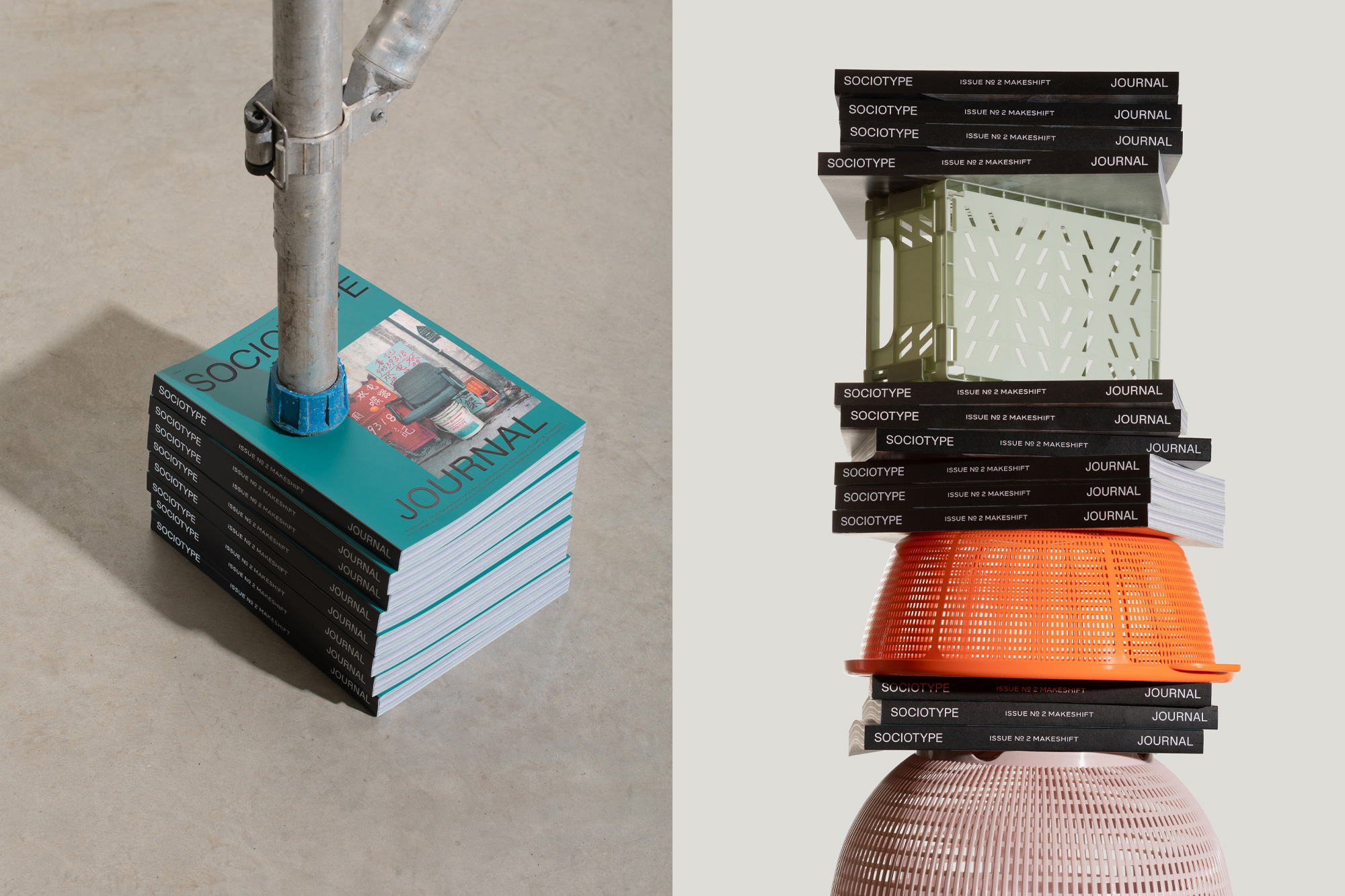
Sociotype Journal is a type specimen for designers who like to read. Published as an annual magazine, each issue explores a theme inspired by and set in a single type family from Sociotype, the foundry launched by London design studio SOCIO in 2021.
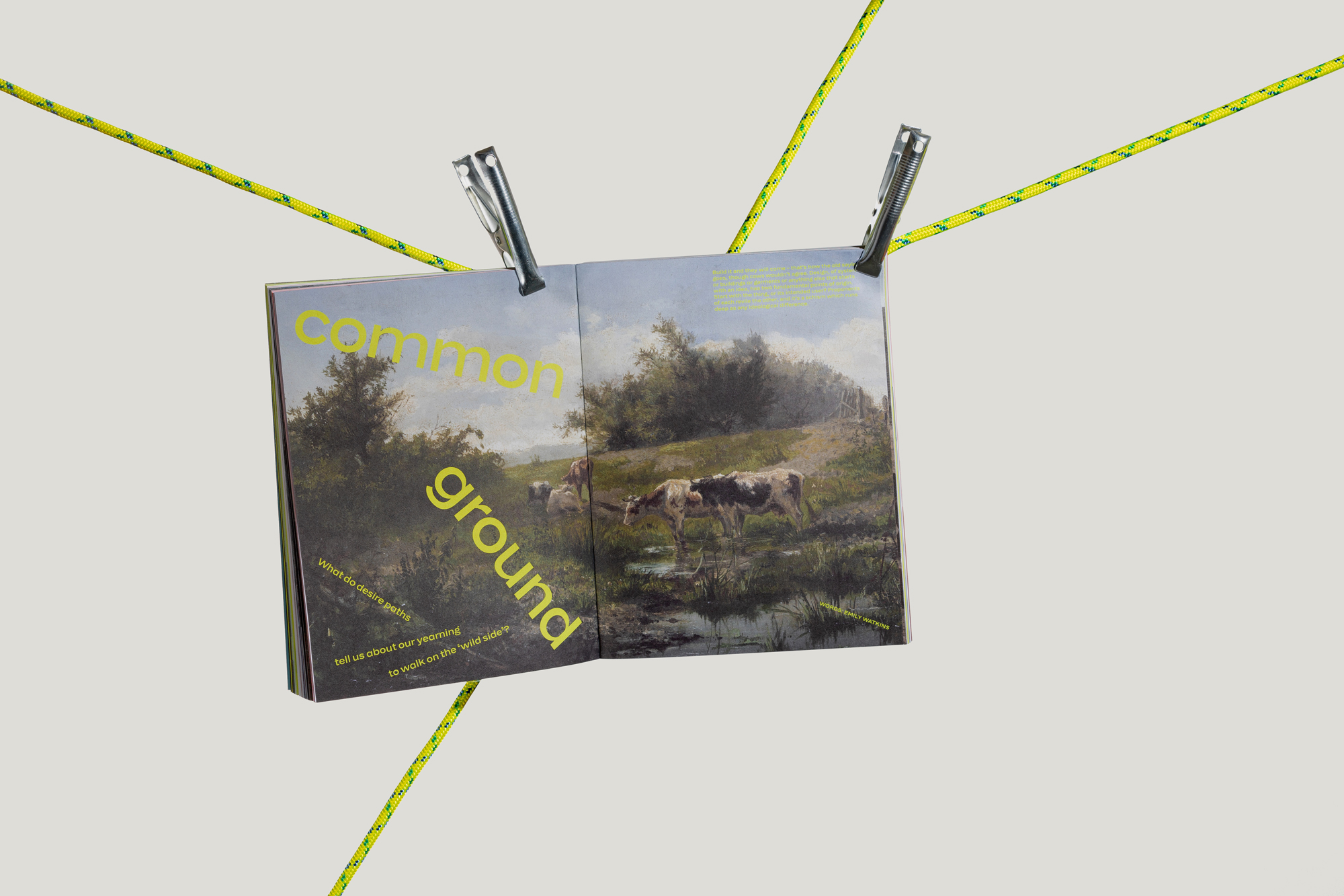
The Journal gives space to demonstrate the breadth and diversity of the large type families from Sociotype, which typically run to 40+ styles. Instead of featuring dummy copy, as most type specimens do, the Journal features original essays and image-led articles that explore the issue’s theme, inspired each time by the characteristics and story behind the featured type family. By offering text for active reading, rather than simply type for looking at, readers are better able to appreciate the qualities of the type, by seeing it in a more realistic context.
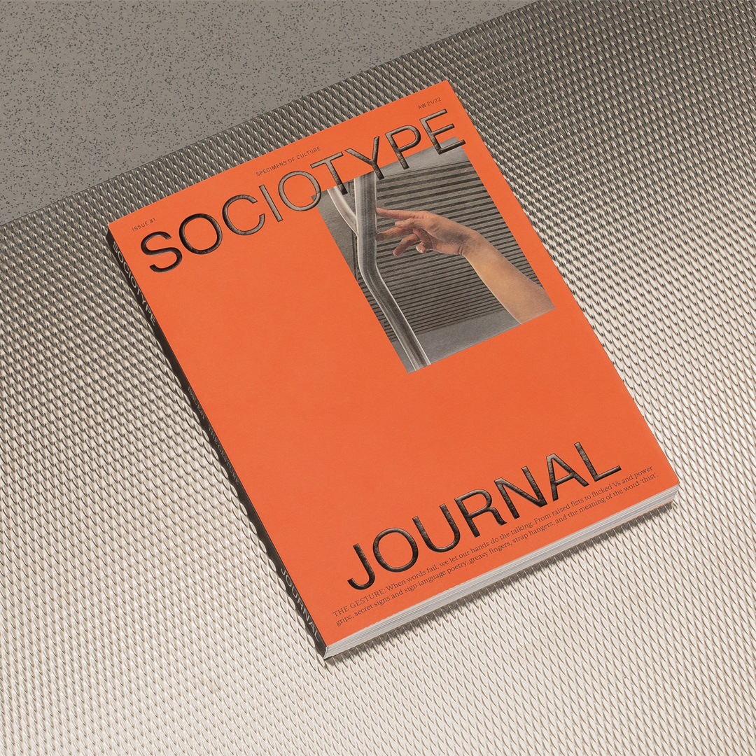
Type plays a functional and aesthetic role, but it doesn’t provide the subject matter. Sociotype Journal is not about typography or graphic design, but anything and everything else. The aim is to show type functioning as it would in the real world, so it’s important to attract a wider audience than type designers, and that it exists outside the bubble of the design industry. Subtitled ‘Specimens of culture’, the themes of the three issues to date – the Gesture, Makeshift and Home have featured articles on subjects as diverse as hobby tunnelling, serial art vandalism, sign language poetry, and extra terrestrial colonisation.
The theme for the most recent issue, titled Home, was inspired by their third type family, Onsite, which was originally designed for in-house use by both Sociotype and SOCIO. Inside we look at how power (or the lack of it) changes what the concept and the reality of ‘home’ means. Essays exploring the theme across two chapters: Masterplan and DIY. The former with articles on topics like utopian masterplanning, replica cities, hostile architecture and a condensed history of the open-plan office. The latter with spite architecture, secret rooms, McMansions, and the countercultural and geopolitical story of geodesic domes.
Printed object
SOCIO conceived the Journal as an opportunity to create some beautiful print on paper (most recently in collaboration with Park Communications), but they were also very much aware of making a three-dimensional object. At 220 pages, it has a certain weight and thickness that’s unusual, particularly for a magazine with no ads.
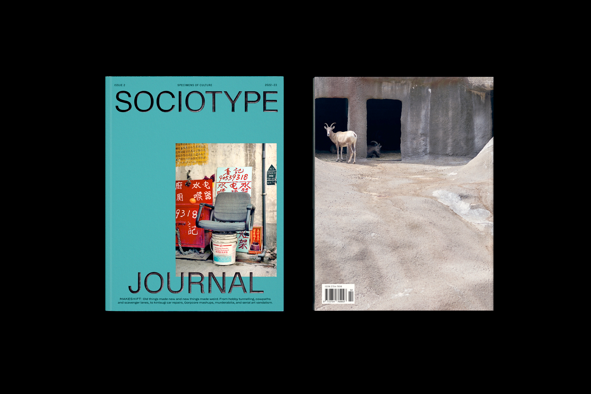
Each issue features four different papers chosen for their contrasting weights and textures. The cover is Stucco Old Mill Classic 280gsm a slightly textured paper with a semi-matt feel that accentuates the embossed glossy black foil of the masthead and the cover image, which is finished with a clear gloss foil.
Inside they mix sections of uncoated off-white paper (Arena Milk 120gsm) for essays and glossy paper (Symbol Freelife Gloss 130gsm in Issue 1 and 2) for image-led articles, printed in four colours with two additional neon Pantones. The neons are used for type and colour blocking, but also they also integrate them into two- and four-colour images throughout.
The magazine concludes with a 20-page technical type specimen and type designer interview (the only place where they focus on type), printed in black ink on uncoated Woodstock Grigio 80gsm. The paper’s light weight means there’s a slight show-through, which gives the section a wonderful ephemeral quality.
SOCIO also designed a bespoke folding mailer to send the Journal out in, which is made from regular fluted craft card finished on both sides with a bright pale yellow Woodstock Giallo and matt black foil.
Credits
Editors – Nic Carter and Henrietta Thompson
Creative Direction – Nic Carter, Nigel Bates, Joe Leadbeater
Design – Nic Carter and Indiya Tupe
Print – Park Communications


