


Swatches:


Printing and specialty Printing
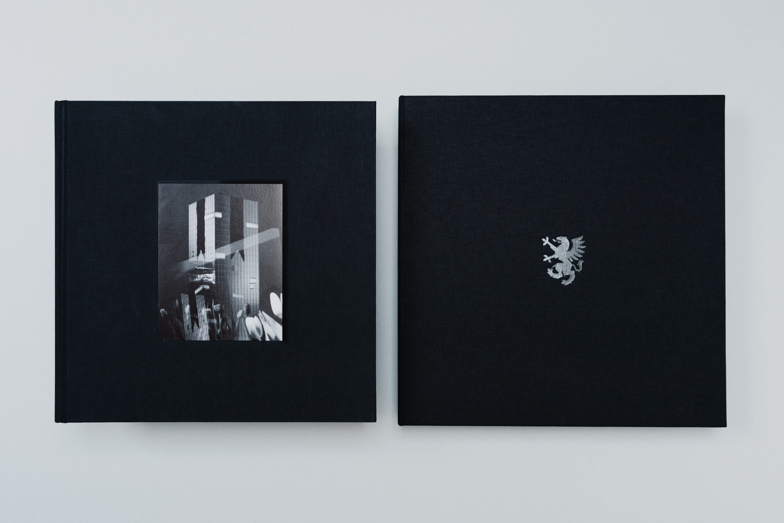
Offset printing is one of the most common techniques used to achieve optimum quality for images and text. The name of the product is often highlighted with printing techniques such as embossed printing and hot foil stamping. The latter is generally used to obtain very realistic metallic colours that are very difficult to achieve with other printing techniques. If the board or paper chosen for a package has dark or bright colours, screen printing allows the application of covering inks that can be highlighted against the background.
Papers Used:
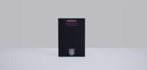
Arena Bulk
Uncoated Whites
Acid Free
ECF (Elementhal Chlorine Free)
FSC® Mix
Heavy Metal Absence
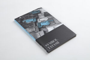
Symbol Tatami
Coated Papers
Acid Free
ECF (Elementhal Chlorine Free)
FSC® Mix
Heavy Metal Absence
Long Life