

We interviewed Samantha Smith, UK designer and founder of the successful stationery brand HELLO TIME to learn more about her creative process and the choice of papers she made.
Q: Sam, tell us something more about HELLO TIME. How did it all start?
A: I not only run HELLO TIME but I’m still very much a hands-on, creative and branding specialist with over 29 years of unique design experience. In 2018 after helping others build successful brands, I thought it was about time I took on the challenge of building my own when I founded HELLO TIME after a period of total burnout. I wanted one place I could keep everything together. So I designed my own, doing a small print run at first to prove the concept. I successfully turned that overwhelm and focus around by using my planner every day to keep everything together so it’s now my vision to help anyone manage the chaos of life through our award-winning planners, productivity pad and notebooks.
The award-winning planner has very quickly become our hero product. You won’t find any gimmicky graphics or unnecessary boxes; our minimal layouts give just enough structure without being too prescriptive. Having been featured on the Style List by Stylist Magazine, Shortlisted for Diary/Organiser of the Year 2023 & The Gift of the Year Awards 2023, it’s becoming the time management tool you won’t be able to live without.
Q: What were your inspirations and your goals?
A: My inspiration was my own experience and knowing that I could not only help myself manage my most precious asset better but others too. After designing the planner I’ve gone on to do lots of research on the subject of time, productivity and time management. I found out that if we are lucky enough to reach 80 years old will get 4,000 weeks on this planet! That motivated me to create more products that help us get out of autopilot, stop us from simple being busy (something that has become associated with success) but more efficient or productive with the time we do have.
Q: Since your brand identity is predominantly black and white, what’s your relationship with colour?
A: Because I trained as a graphic designer, colour trends have always been a big part of my career. But they come and go, different shades fall in and out of favour quickly. I find I quickly get bored of a colour especially in interiors. This is where the love of neutral, classic colours comes from. Shades that have a forever appeal and are timeless. But the black and white element of my products came out of a need for calm and clarity as I explained above
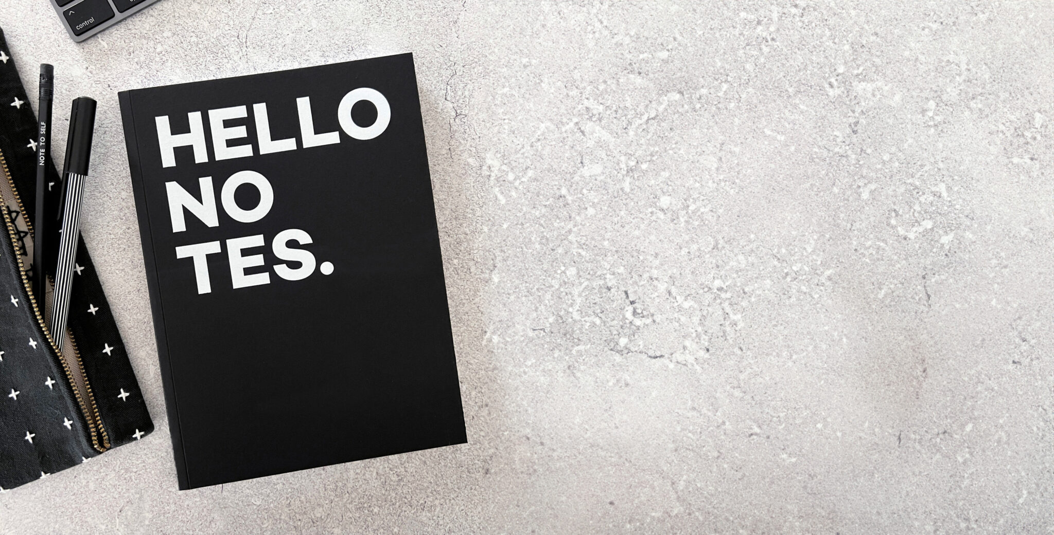
Q: Your Hello Notes are full of positive messages inside. What’s the role of typography in delivering those messages?
A: Very important, using different typographic styles helps the messages stand out. They change the pace of the layouts and give messages hierarchy, add energy, inspire and motivate.
Q: What were you looking for in a cover? How important is paper in your creative process?
A: I wanted something tactile and something very different to my competitors. The cover on Fedrigoni Sirio Ultra Black communicates the endless possibilities of the planner and it’s main USP, the fact that you can document everything in one place, notes, schedule, ideas, goals etc. The cover is a distinctive asset for the HELLO TIME brand. Paper is everything I’ve worked with print for almost 30 years, I love paper and print and the endless possibilities you can create.
Discover more about Sirio Ultra Black here.