British publishing house The Mainstone Press undertook a compelling project that delved into the intricacies of reprinting (and re-editing) rare French classics of the art deco period. Dubbed the Parisian Trilogy or Boutiques – as we might call it – it had a long incubation period. It all began almost a decade ago in a bookshop in Norfolk when the founder, Tim Mainstone, first encountered the work of British artist Eric Ravilious. His illustrated book High Street (1938), which explored shopfronts in the style of the French livre d’artiste genre, led Tim to discover the captivating world of French illustrators Lucien Boucher and Henri Guilac, both active in Paris during the 1920s. Three original books sparked his imagination.
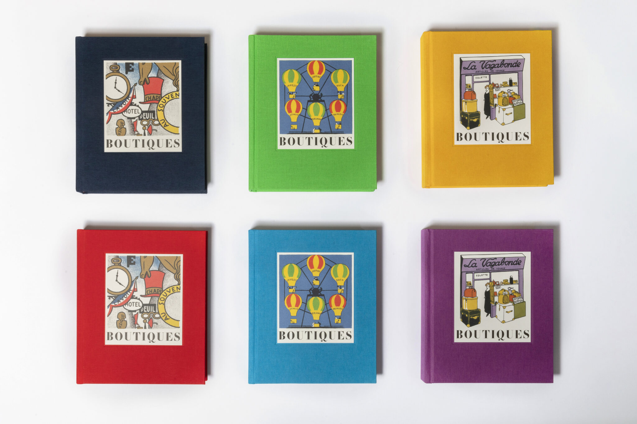
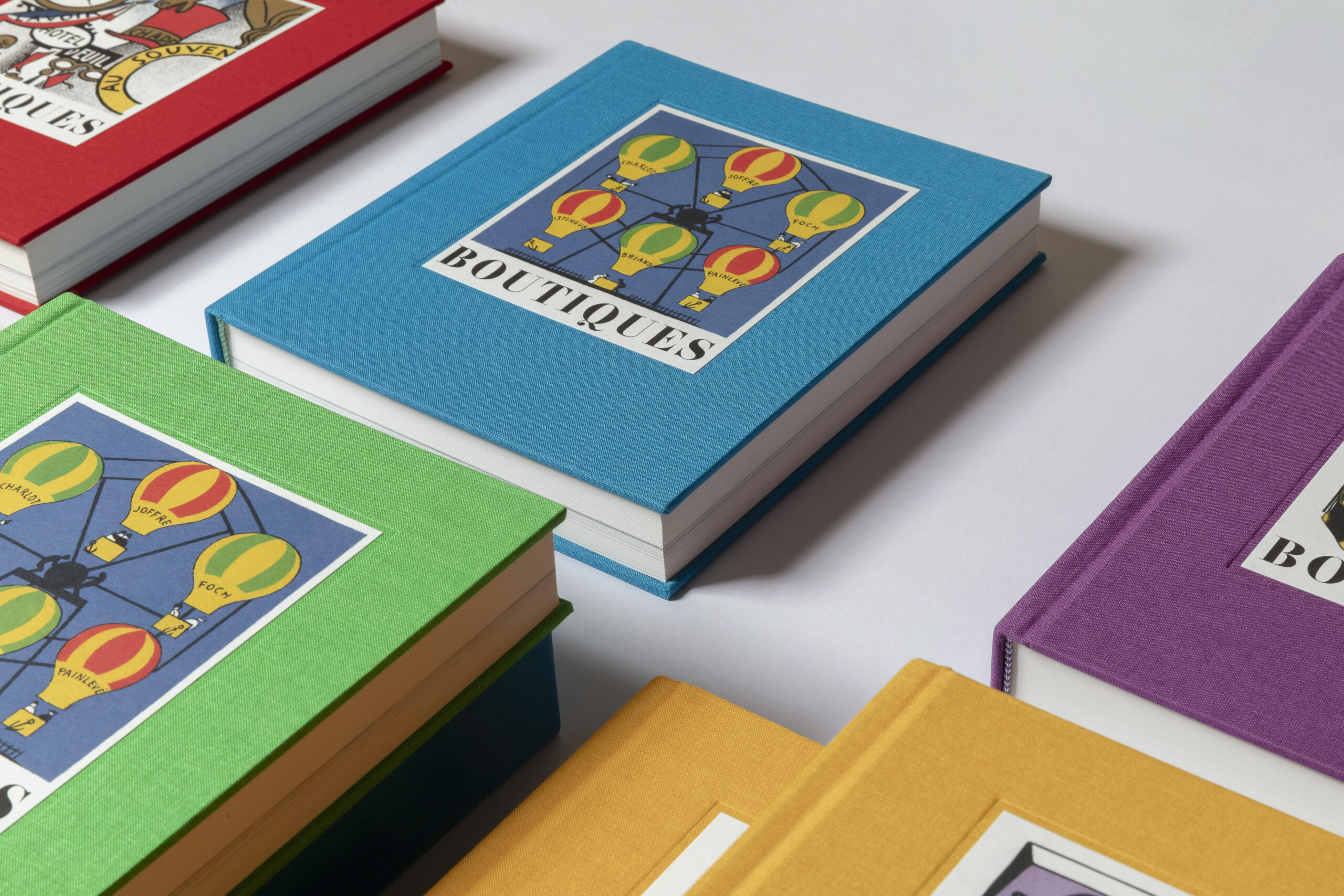
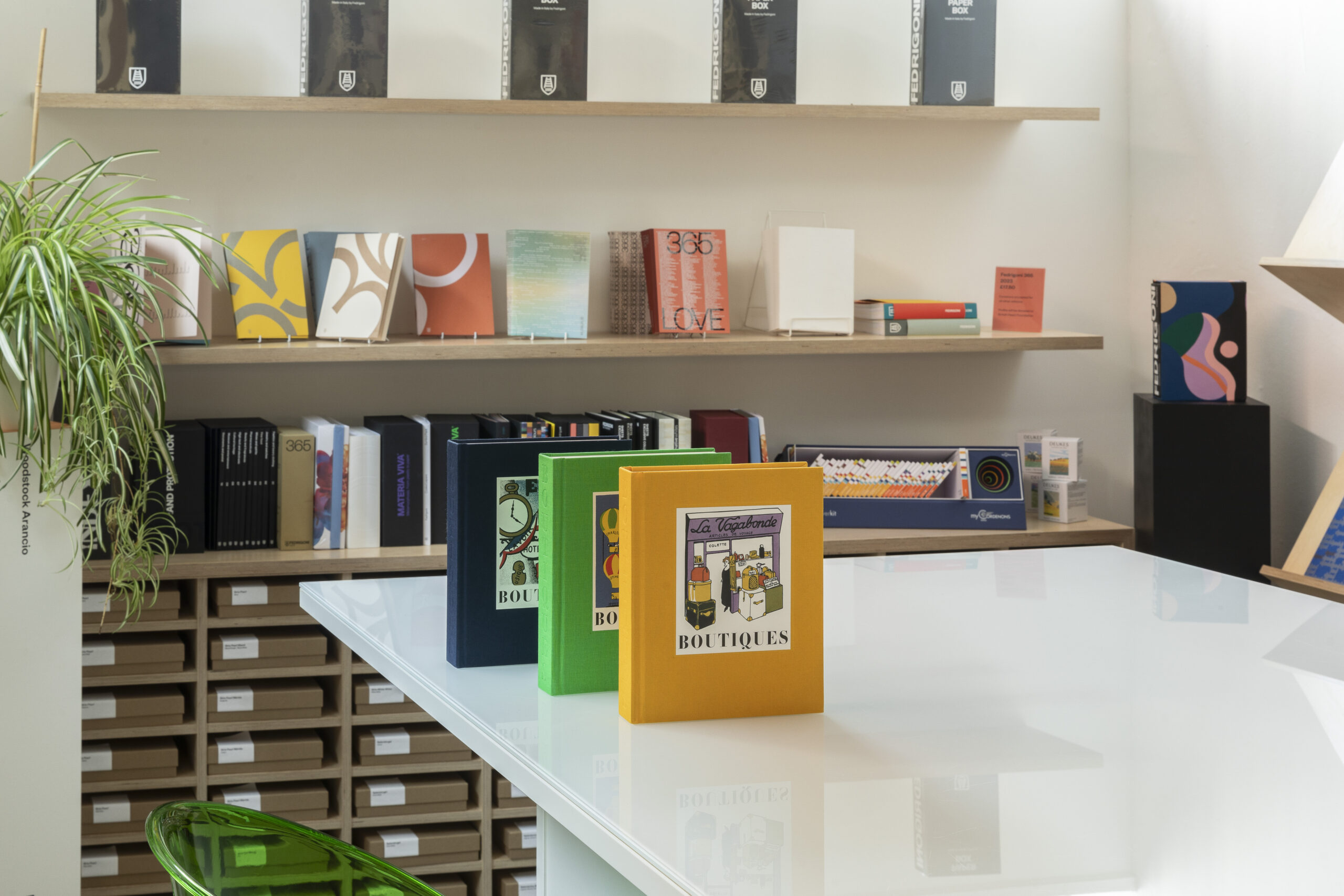
The first book, Boutiques was originally published in 1925 by Marcel Seheur with lithographs by Lucien Boucher showcasing shopfronts and surreal text by Pierre Mac Orlan. The same year, Paris hosted the International Exhibition of Modern Decorative and Industrial Arts and the Rue de Boutiques at the heart of the Exhibition became a distinctive trademark of the Parisian lifestyle. The book sold out, leading to a second book called Boutiques de la Foire which depicted Paris’s fairground rides and stalls. Meanwhile, another publishing house, Simon Kra, worked on similar terms with Pierre Mac Orlan and caricaturist Henri Guilac on a book called Boutiques Littéraires, a visual jeu d’esprit portraying the great French writers of the 1920s as fictitious shopkeepers, using a hand-coloured process called pochoir.
From the start it was quite clear that releasing a second edition of these lost masterpieces would have come with some challenges. First of all, the legal aspect. It took the help of a Parisian researcher and genealogist to navigate French copyright law and get in touch with the Lucien Boucher Estate and Pierre Mac Orlan Committee, both of whom approved the project. Secondly, it was never supposed to be a simple reprint but a new edition with the ambitious role of helping the audience comprehend the value and historical context behind the original books. Mainstone Press worked with design agency Webb & Webb which was committed not to produce a straightforward facsimile. This entailed having new captions written by Andrew Stewart together with the English translation of Mac Orlan’s original text made by Shaun Whiteside, as well as a strong paratext with essays covering the historical and artistic value of the project itself. For the essays Mainstone worked with three highly regarded authors – Ravilious curator James Russell, Franco-American writer Lauren Elkin, and fairground aficionado Pascal Jacob.
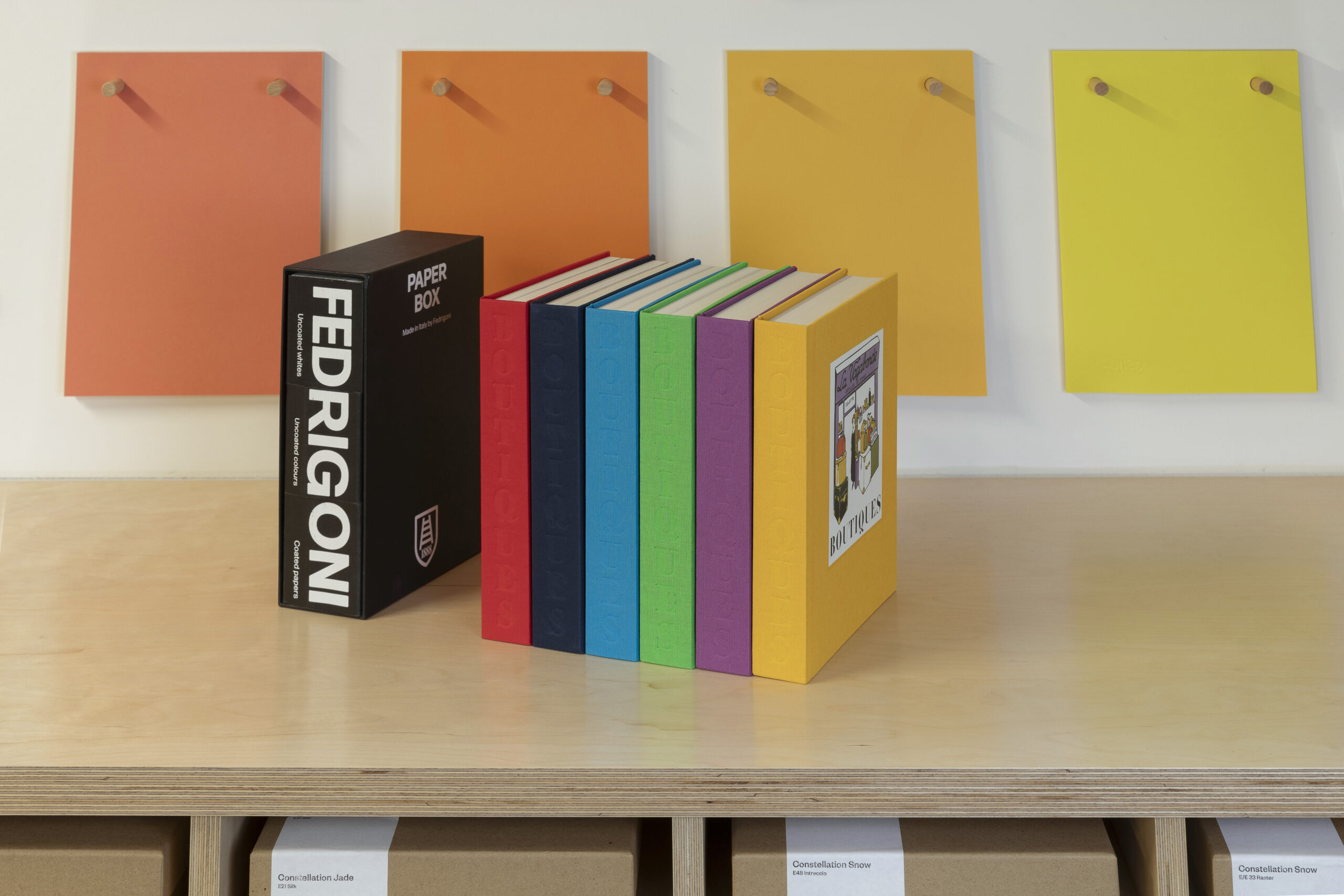
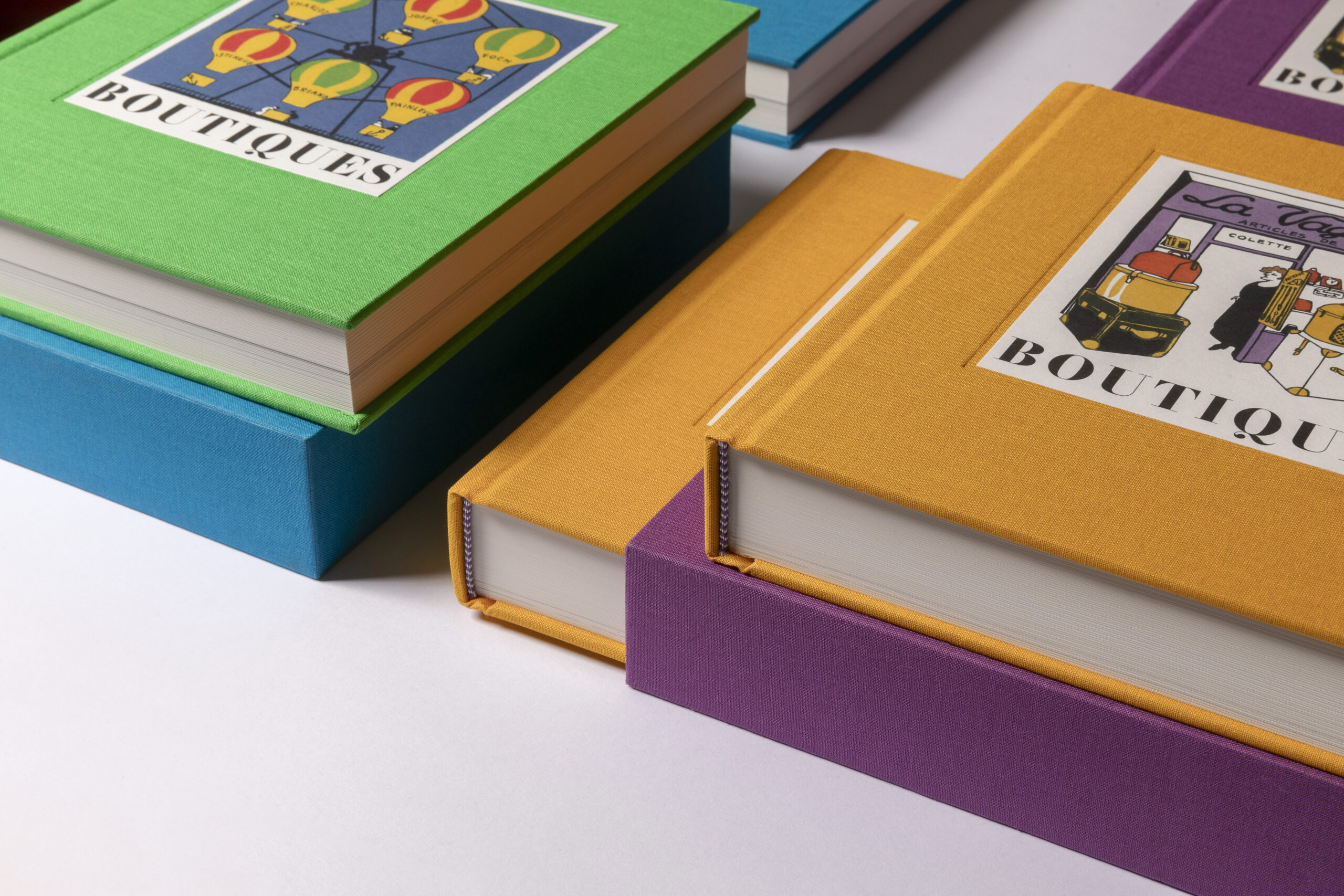
Finally, Boutiques was complex from a technical standpoint. Mainstone Press worked closely for three years with consultant David Arkell, owner of & Printed, to deal with the proofs of the illustrations that were printed at Kingsbury Press. Even after 100 years, the pigments of the original books still look strong and vivid. Lithography and the pochoir process set the bar very high for anyone attempting a reproduction. Matching the vividness of the colours was indeed the true quest.
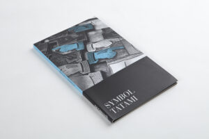
The paper of the original books was a beautiful off-white uncoated paper, but after some tests it was obvious that only a lick coated paper could achieve the desired result with the offset printing. Fedrigoni’s Symbol Tatami Ivory 150 gsm was chosen for its high bulk, matt finish, and the sharpness in detail rendering. Sticking to the original version, a creamy ivory shade was selected, requiring a careful colour proofing for the 350 illustrations across the three volumes.
Each book of the trilogy was released in a limited run of 500 copies, becoming a collector’s item. Additionally, Boutiques Littéraires won the 2023 British Book Design & Production Award for Literature.
Limited copies of the books are still available here.