Quinta dos Montes – Parcela Nº5
We were walking through the beautiful vineyards of Quinta dos Montes, in the Douro Valley, with our good friend, and the estate’s winemaker, Pedro Sequeira, as he was telling us about his latest creation, a single vineyard wine from a very special parcel of the estate.
When we reached Parcela Nº 5, we definitely felt something special and unique! It is hard to put in words just how magic Douro’s very old vineyards are… This is a tiny parcel, totaling only 0,61 hectares but with such a huge diversity, 23 different varieties identified with more than 100 years old. It was like entering a living museum!
Pedro was explaining the love and care devoted to this vineyard, how plants are tended one by one, or “Cêpa-a-Cêpa” in local dialect, and his dream to somehow express the spirit of the place and the complex texture that the old vines have into the bottle. All of a sudden a lot of ideas were growing in minds. We kept walking and thinking… The moment we finally tasted the wine was like an epiphany, everything felt right on the spot, the 23 “grape musicians” were playing this astonishing symphony, super complex, full of layers, but at the same time incredibly elegant and refined. Beautiful!!!
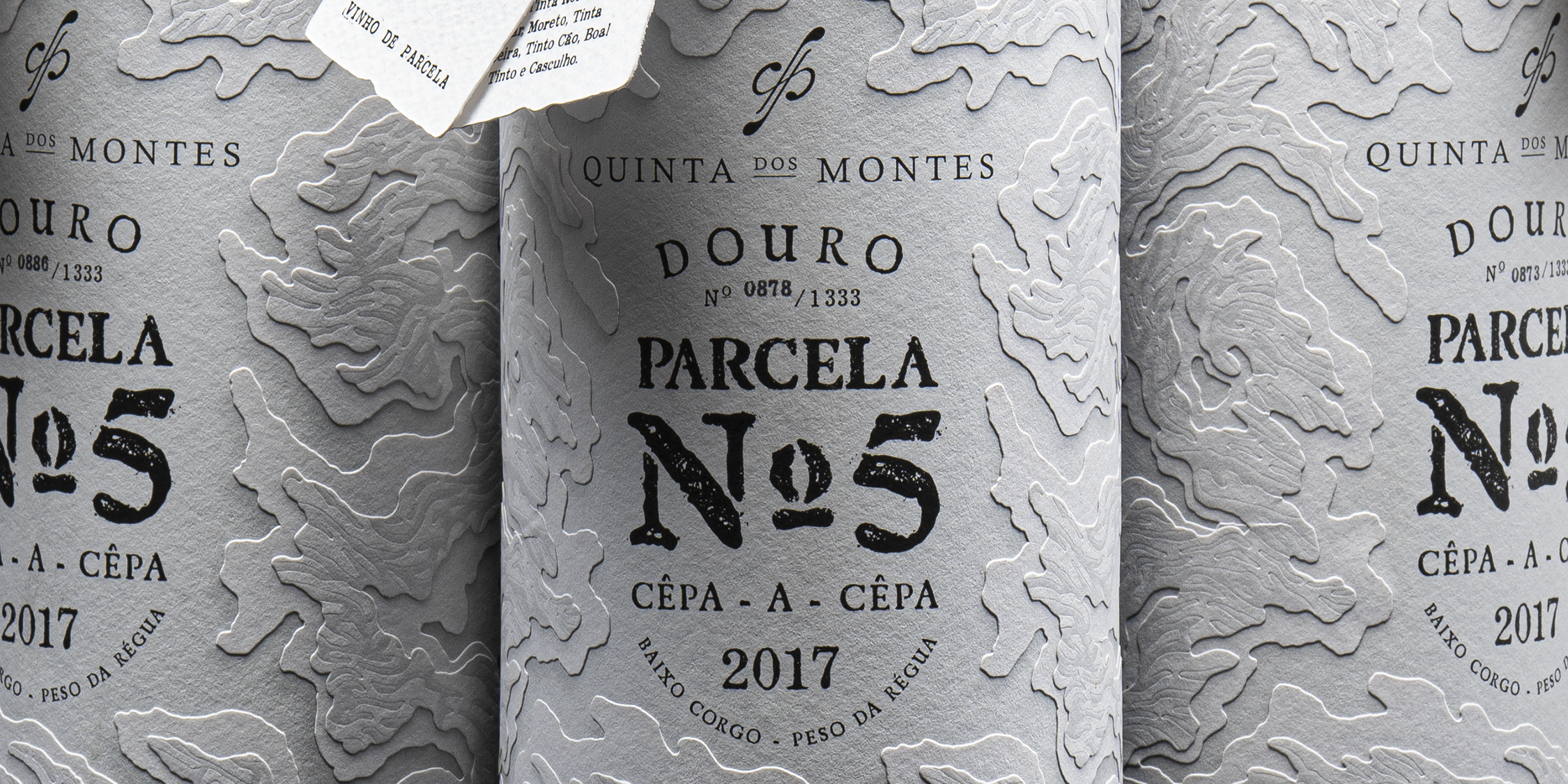
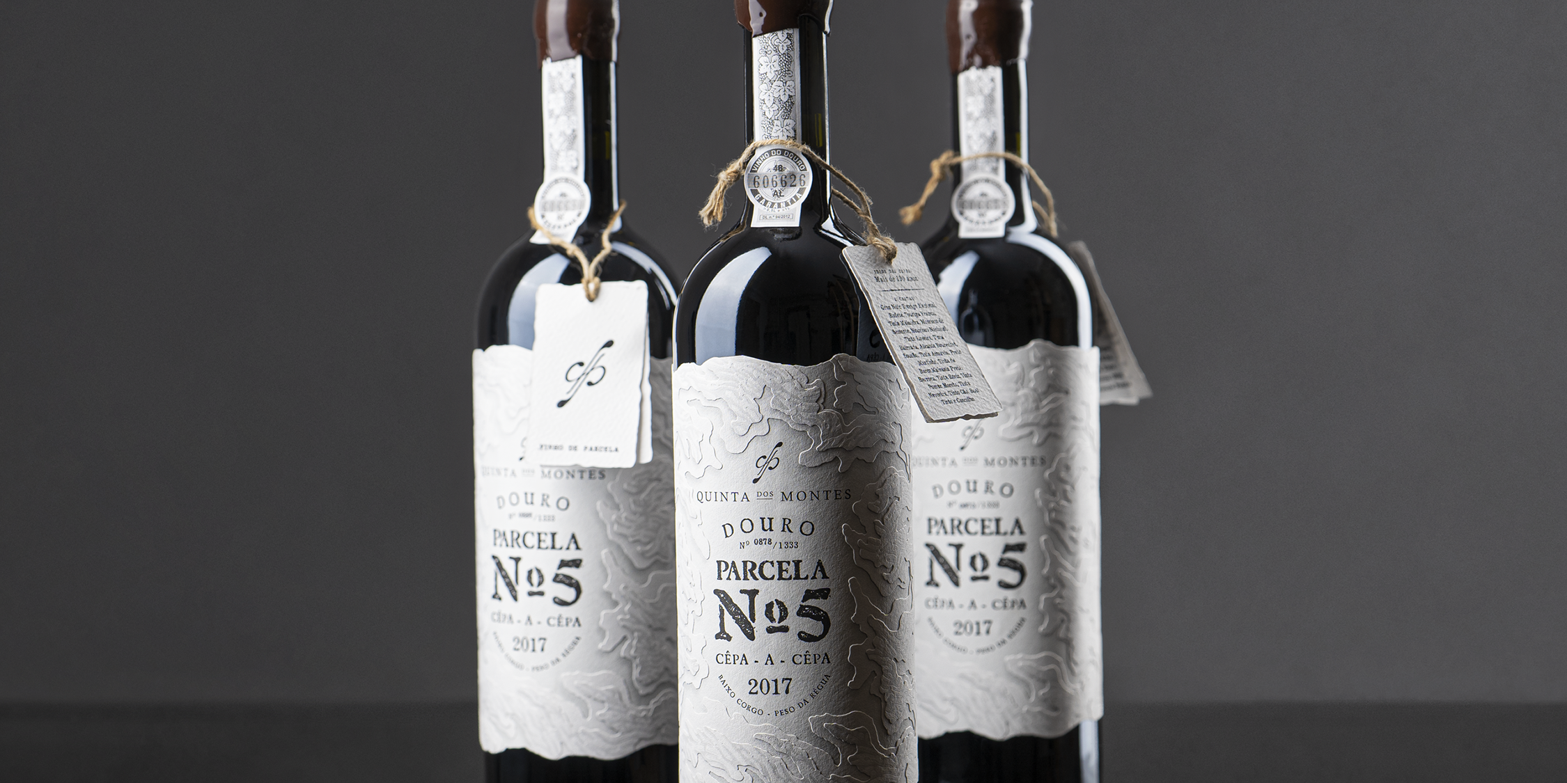
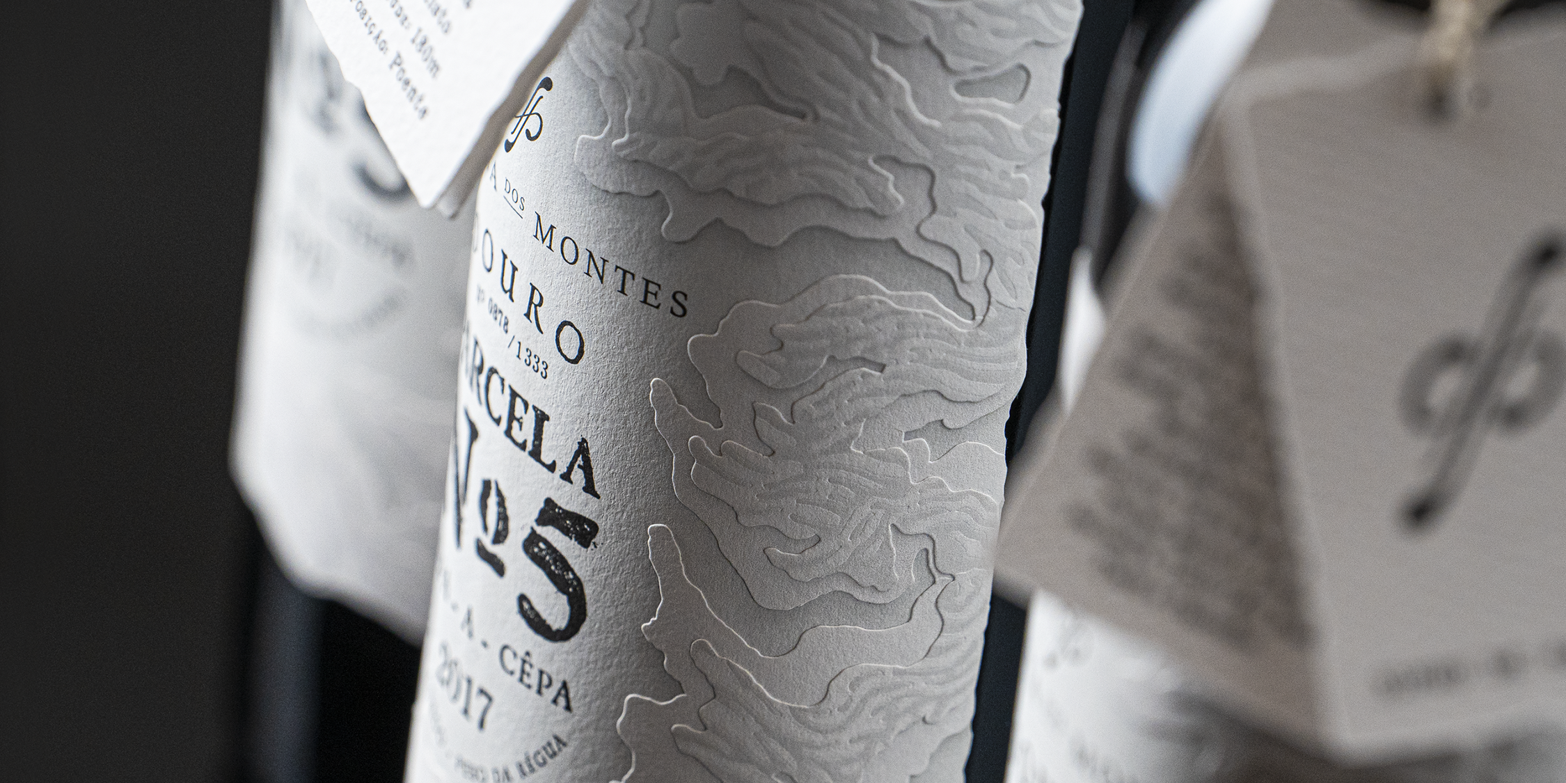
As soon as we got back to our creative cellar, the desk, paper, pencil, spontaneously experiments started to pop. We were cutting different shaped layers of paper trying to recreate some ideas we had to represent the vines when the second epiphany took place: we realized we could integrate this dual concept, that would communicate at the same time the complex layered textures from the old vines and the outstanding topography of Douro’s vineyards!
That was it! We shared the sketches with Pedro that instantly loved the idea. Right after, we jumped to a meeting with our good mates Manuel Ribeiro and João Santiago, at VOX graphic house, that got just as excited and promptly embraced this challenge with us!
In the end, due to the complexity of the shapes and the fine details of each layer, even at VOX some of the production process had to be manually done, one by one, just like the care for those centenary vines and our design approach that was utterly artisanal.
All about this wine, in every stage, was born out of this passion for craftsmanship, resulting in an authentic and rare gem. Only 1333 bottles were released, therefore making the motto “Cêpa-a-Cêpa” really meaningful and worthy.


