La torre fantastica
Antico Castello is a family, a territory, a history. The story of two brothers who take over the reins of their parents‘ winery, the only company in the sector in a municipality that the 1980 earthquake completely razed to the ground. We are in San Mango sul Calore, a town that has literally risen from its ashes and is now included in the Taurasi DOCG area. Chiara and Francesco asked us for a packaging and rebranding project: they wanted labels that were iconic and an image that spoke of rebirth.
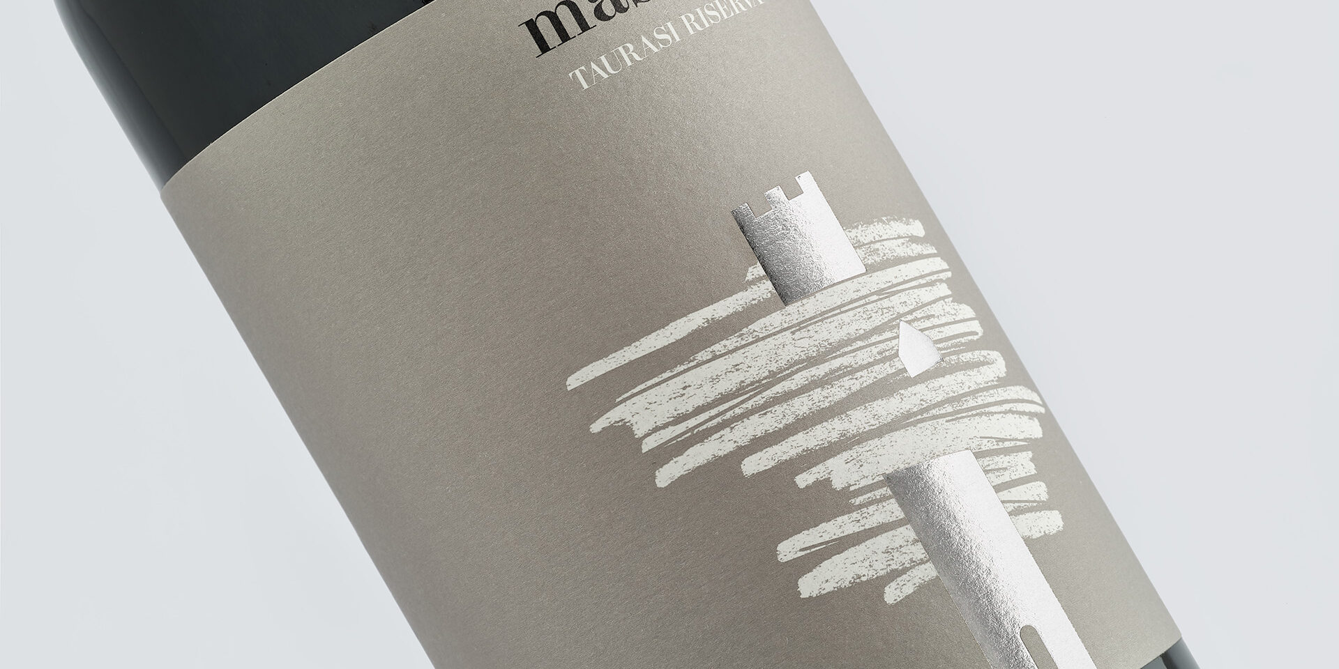
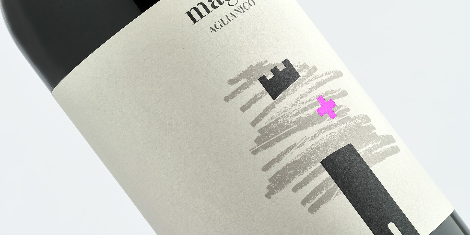
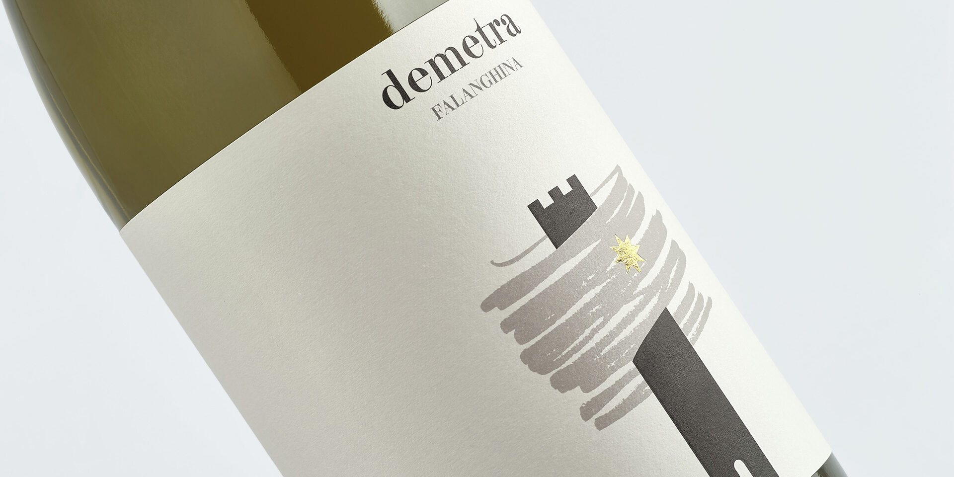
The elements were all there: a castle in the name, a story to tell, the magic of every restart. We have condensed these suggestions into an impossible, black tower: a fantastic figure that is interrupted and reborn by a gestural sign, evoking the graphic peaks that the seismograph needle marks during an earthquake. A sign that becomes solid, a figure that pierces the telluric upheaval of the line, creating depth. The exact visual transposition of a company reborn from nothing. A condensed and full image to characterize the labels of the selection and the new image of the company. Each wine has a name and each name is associated with an icon that distinguishes it: breaking elements, all printed in colored foils to enhance the Warm Gray tones of the FreeLife Merida Arconvert paper. The Aglianico is called Magis and has a magenta colored addition mark as its distinctive trait. The Greek has the wing of Hermes in blue. Falanghina brings the light of Mother Earth Demeter in the form of the sun star in gold. The Fiano Orfeo is a circle in shades of green to remember the life that returns. The Taurasi could only be home.


